
Adding Live Filters to a View
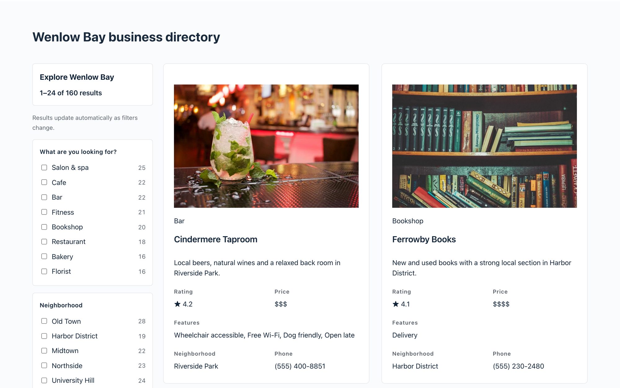
Live Filters adds a sidebar of filters to a View. Visitors narrow the entries with checkboxes, dropdowns, range sliders and star ratings, and every option shows how many entries match before they click. This article explains how to turn on Live Filters, add filters, configure each one and choose how the sidebar works.
Live Filters is part of GravityView Pro. The All Access Pass includes GravityView Pro.
Before you begin #
- Install and activate the latest version of GravityView Pro.
- Create a View, or open one you already have. Live Filters is added to an existing View, so your fields, layout and settings stay as they are.
Step 1: Turn on Live Filters and set up the sidebar #
- Open your View in the View editor.
- In the Settings box below the layout, click Live Filters.
- Turn on Enable Live Filters.
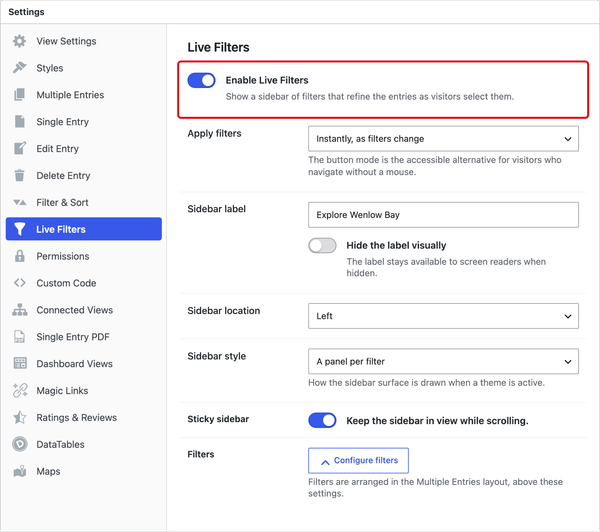
The sidebar settings appear once Live Filters is on:
| Setting | What it does |
|---|---|
| Apply filters | Instantly, as filters change updates the results with every click. After pressing an “Apply” button waits until the visitor presses Apply, which suits visitors who navigate with a keyboard. |
| Sidebar label | The heading above the filters. Hide the label visually hides it on screen and keeps it for screen readers. |
| Sidebar location | Left or Right of the entries. |
| Sidebar style | One panel for all filters, or A panel per filter. This applies when the View uses a theme. |
| Sticky sidebar | Keeps the sidebar in view while visitors scroll the entries. |
Step 2: Add filters #
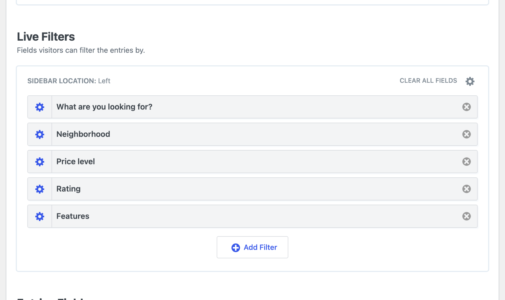
Filters live in their own Live Filters area in the Multiple Entries Layout tab, above Entries Fields. The Configure filters button on the settings tab takes you there.
- Click the Multiple Entries Layout tab.
- In the Live Filters area, click Add Filter.
- Choose a field from the list. You can type in the search box to find it.
- Repeat for each field visitors should filter by.
Fields that are already filters are greyed out in the list. Drag a filter, or use the arrows that appear when you hover over it, to change its order in the sidebar.
Which fields can be filters
The field type decides how a filter can display:
| Field type | Filter displays |
|---|---|
| Fields with choices (Drop Down, Radio Buttons, Checkboxes, Multi Select) | Checkboxes, radio buttons, dropdown or searchable dropdown |
| Number fields | Range slider |
| Date fields | Date or date range |
| Ratings | Star rating |
Step 3: Configure each filter #
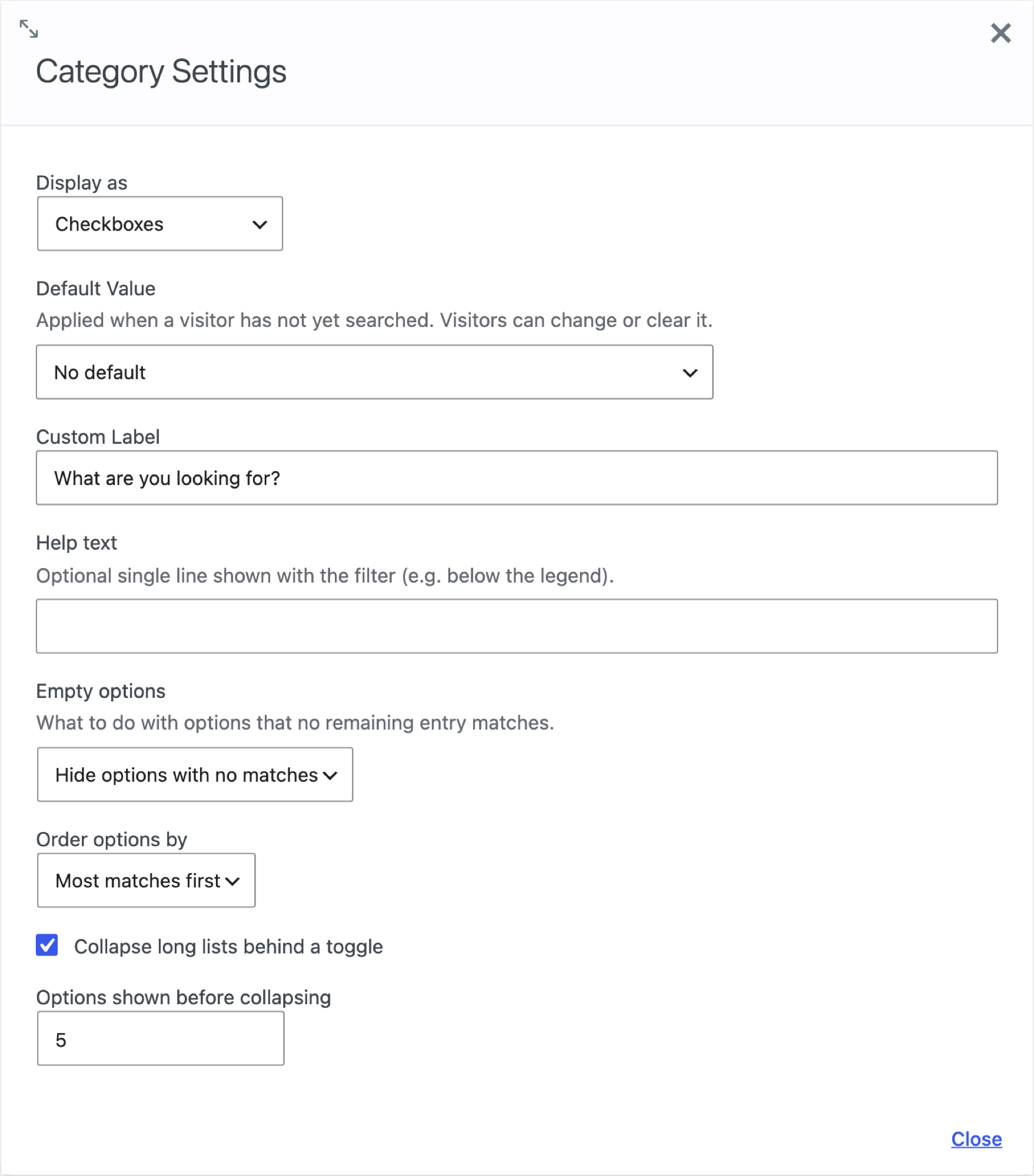
Click the gear icon on a filter to open its settings.
| Setting | What it does |
|---|---|
| Display as | How the filter appears in the sidebar. See the display types below. |
| Default Value | A choice that’s selected when a visitor first opens the View. Visitors can change or clear it. |
| Custom Label | The filter’s heading in the sidebar. Leave it empty to use the field label. |
| Help text | An optional line shown with the filter, below its heading. |
| Empty options | What happens to options that no remaining entry matches: Hide options with no matches, or Show them greyed out. |
| Order options by | Form order keeps the order of the choices in the form. Most matches first puts the options with the highest counts at the top. |
| Collapse long lists behind a toggle | Shows the first few options and a Show more link. Options shown before collapsing sets how many appear (5 by default). |
Display types
| Display as | Best for |
|---|---|
| Checkboxes | Letting visitors pick several options. Entries that match any of the ticked options appear. |
| Radio buttons | One option at a time, with every option visible. |
| Dropdown | One option at a time, when space in the sidebar is tight. |
| Searchable dropdown | Long lists. Visitors type to find an option, and the choices load as they type. |
| Range | Number fields such as prices or sizes. Visitors drag a slider or type a minimum and maximum. |
| Star rating | Ratings. Visitors pick a minimum, such as “4 stars and up.” |
Range filter settings
A Range filter has its own settings in place of the options settings.
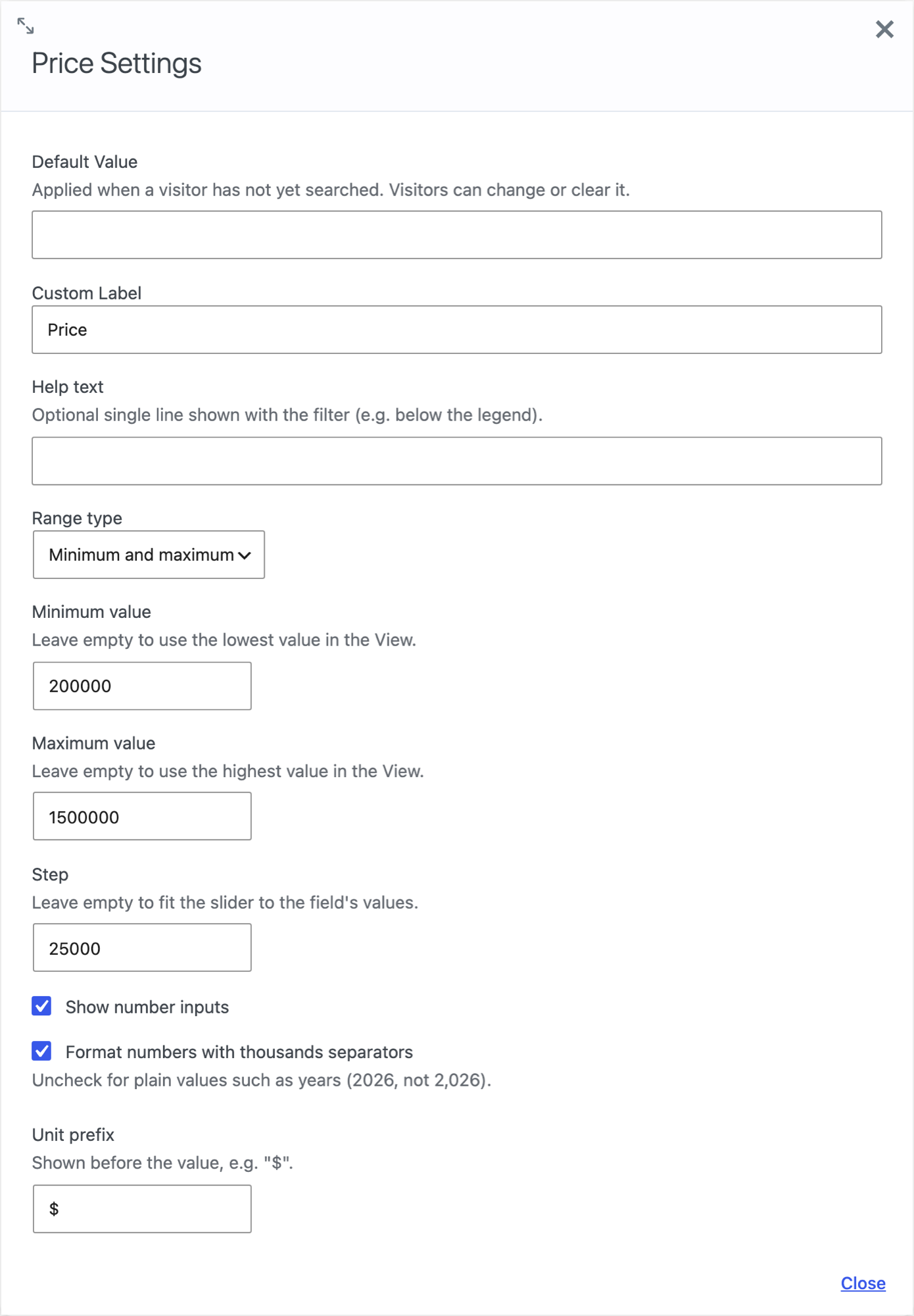
| Setting | What it does |
|---|---|
| Range type | Minimum and maximum shows two handles. Maximum only shows one, for filters such as “Up to $500.” |
| Minimum value and Maximum value | The ends of the slider. Leave them empty to use the lowest and highest values in the View. |
| Step | How far the slider moves at a time. Leave it empty to fit the slider to the field’s values. |
| Show number inputs | Adds boxes where visitors can type the numbers. |
| Format numbers with thousands separators | Shows 1,500,000 rather than 1500000. Turn it off for values such as years. |
| Unit prefix and Unit suffix | Text shown before or after the value, such as $ or km. |
Step 4: Save and test #
Click Update to save the View, then open the page where the View is embedded.
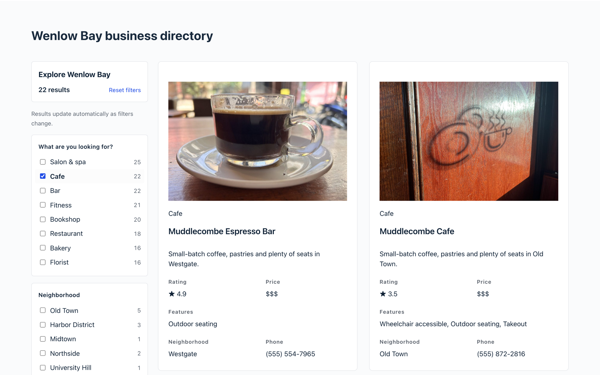
Tick an option and check that the results narrow and the counts in the other filters change. In the example below, choosing Cafe leaves 22 results, and the Neighborhood filter now counts only cafes.
How visitors use Live Filters #
- Counts before they click. Each option shows how many entries match, based on the other filters already chosen.
- Several options in one filter. Ticking two boxes in the same filter shows entries that match either one.
- Several filters together. Choices in different filters combine, so entries have to match all of them.
- Reset filters clears every choice at once.
- Shareable links. The page address updates with the filters, so a visitor can bookmark or share a filtered list.
- Phones. On small screens the sidebar folds away, and visitors open it with Show filters.
Using Live Filters with the search bar #
A View can show the search bar and Live Filters together. A keyword search in the search bar narrows the entries, and the count on every filter option updates to match. Choosing filters then narrows those results further, and the page link keeps both.
Layouts that work with Live Filters #
Live Filters works with Views in the Table, List and Layout Builder layouts, DataTables, Maps (the pins follow the filters) and DIY layouts, and with Views that use Multiple Forms to join entries from more than one form.

