Known limitations of the Responsive Tables mode of DataTables
The Responsive Tables mode of DataTables is excellent to group additional columns on your View to save horizontal space but has some known limitations:
- Fancybox Gallery: Items are duplicated when the File Upload field is hidden by DataTables Responsive Mode
- The Approve Entries field doesn’t work when the Responsive Tables mode is active
- The DataTables built-in search field can only search on visible columns
FixedHeader and Responsive Tables conflict
If your table columns become misaligned from their headers after filtering or sorting, you likely have both FixedHeader and Responsive Tables enabled at the same time. These two features work against each other: Responsive Tables hides columns that don’t fit the screen and restructures the table layout, while FixedHeader clones the header row and floats it above the table. When both are active, the cloned header and the actual data rows lose sync whenever the table redraws (after filtering, sorting, or pagination).
How to fix this: Disable one of the two features in your View settings under the DataTables tab.
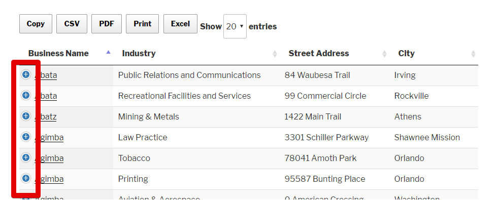
- Keep Responsive Tables if your users are on mobile devices or your table has many columns that won’t fit on smaller screens. Responsive mode collapses extra columns behind a “+” icon so users can expand them on demand.
Keep FixedHeader if your table has many rows and users need the header to stay visible while scrolling down. This works best when all columns fit on screen without needing to hide any.
Both settings are in the View editor under the DataTables section. If you’re unsure which to keep, Responsive Tables is generally the safer default since it handles varying screen sizes automatically.