
Themes: a fresh new look for your Views
GravityView 3.0 introduces themes, a new way to give your View a refreshed, modern design that works with every layout and automatically adapts to your theme’s colors and fonts, all without writing any CSS. A View is GravityView‘s front-end display of your Gravity Forms entries, and a theme updates how that display looks the moment you apply it.
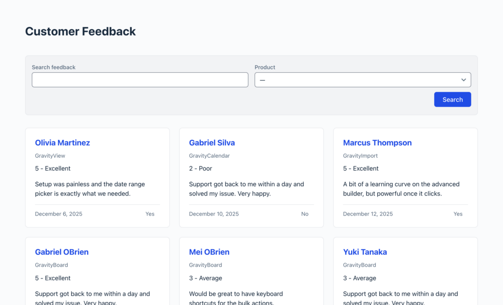
GravityView 3.0 ships with two themes: Legacy, the classic look your existing Views already use, and Vantage, the new built-in theme. Choosing Vantage does two things, and the second one is optional. On its own, it restyles your existing View while keeping its current layout. If you want, it can also arrange your entries into a multi-column card grid, where each entry becomes a self-contained card. This article covers both, plus how to fine-tune the result.
A brief introduction to the Vantage theme
Before you start #
Make sure you have the following in place:
- GravityView 3.0 or later. Themes are a 3.0 feature.
- A View you can edit. The theme is a per-View setting, so you choose it for each View individually.
- A few entries to display. Having real entries makes it easier to preview the styling as you work.
How to apply the Vantage theme #
- Open the View you want to update in the WordPress editor.
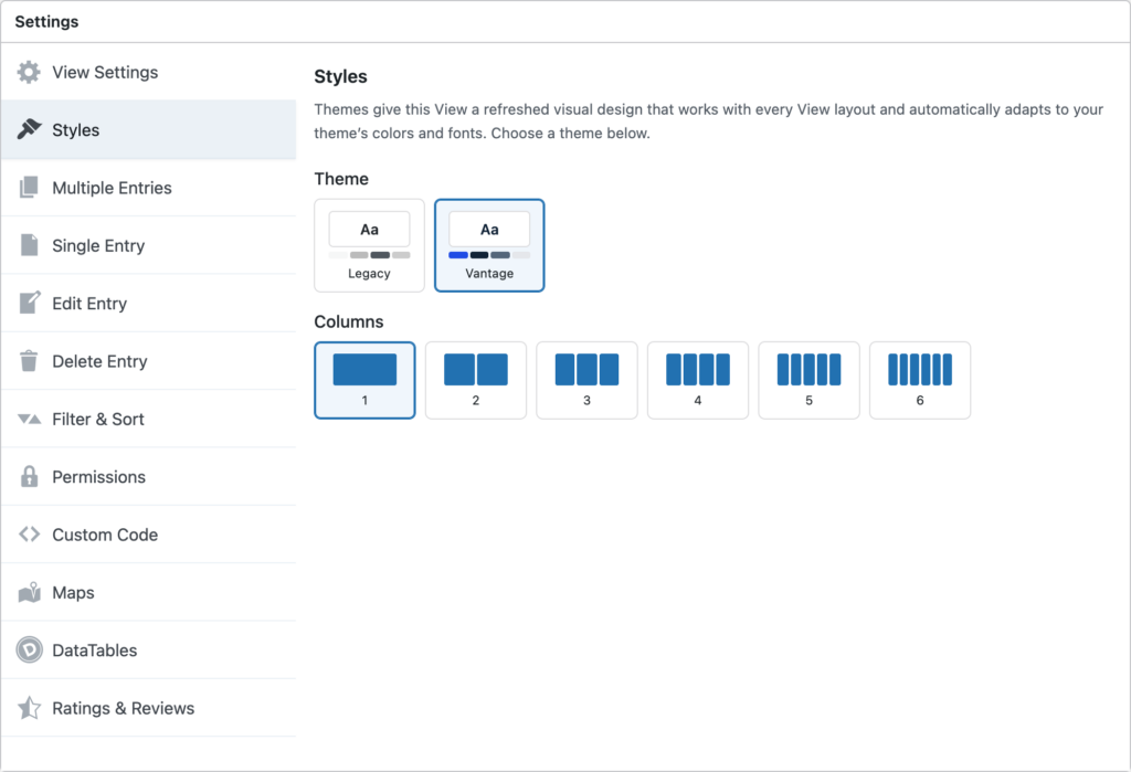
- In the View Settings panel, click the Styles tab.
- Under Theme, choose Vantage.
- Click Update to save the View.
New Views use Vantage by default. Your existing Views stay on the Legacy theme until you switch them over, so nothing changes about how they look until you’re ready. By default, Columns is set to 1, so your View stays in a single column. Applying Vantage on its own simply gives your existing View a refreshed look without changing its layout. For many Views, this is all you need, and you can stop here.
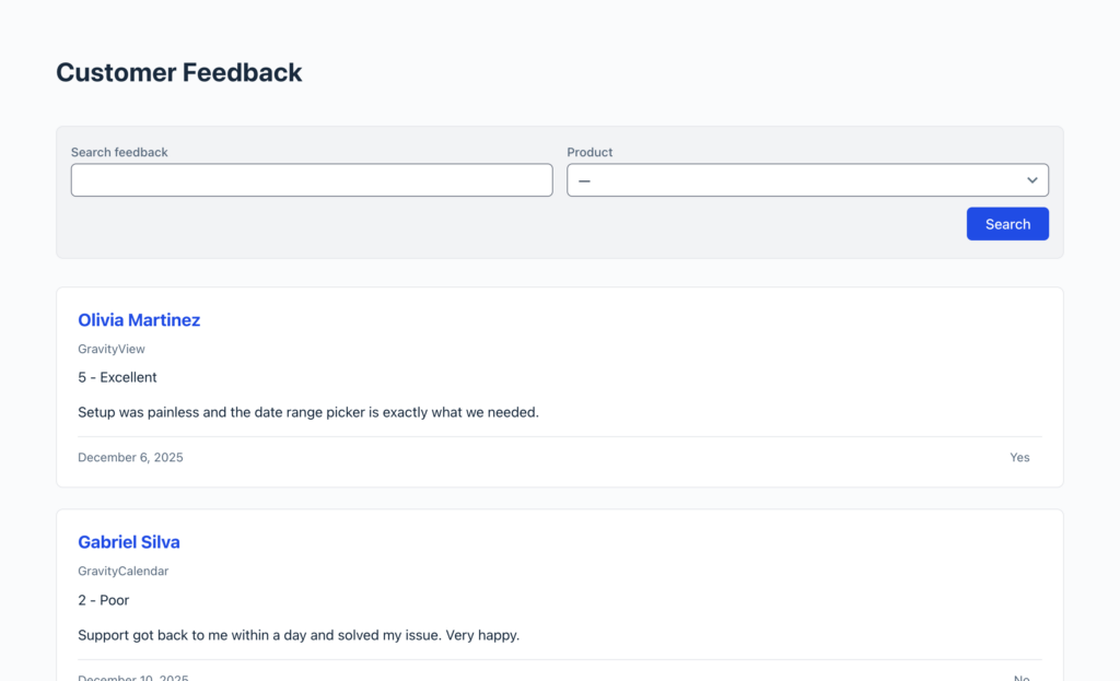
Here is the same View with Vantage applied at a single column. Notice the refreshed search bar and the cleaner card around each entry, with no change to the single-column layout.
Displaying entries as a card grid (optional) #
When Vantage is applied, the Styles tab gives you two controls for the grid:
| Setting | What it controls |
|---|---|
| Columns | The number of columns of cards. 1 keeps a single-column View; choose 2 through 6 to create a card grid. |
| Equal Height | When enabled, every card in a row matches the height of the tallest card, so rows stay tidy even when entries hold different amounts of content. |
To create a grid, set Columns above 1, then click Update and preview your View. A card grid works well for directories, team or staff listings, portfolios, and product catalogs, where each entry reads better as a tile than as a row.
Choosing how many columns to use #
There’s no single correct number of columns. It depends on how much content each entry holds and how you want the View to read. As a starting point:
- One column works for detailed entries, longer content, or when you simply want the Vantage theme for the refreshed look.
- Two columns suit listings that mix short text with a small image.
- Three or more columns fit compact cards, such as a photo gallery or a directory of brief profiles.
It’s worth trying a couple of values and previewing each before you settle on one.
Before and after #
Comparing the same View in three states makes the change easy to see:
- Legacy theme — your View’s classic appearance.
- Vantage, one column — the same View, restyled, with no layout change.
- Vantage, multiple columns — the same entries arranged as a card grid.
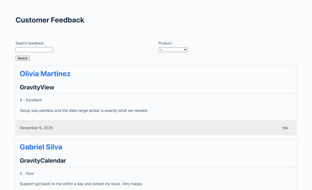
Here is the starting point, with the Legacy theme:
Using Vantage with the Table layout #
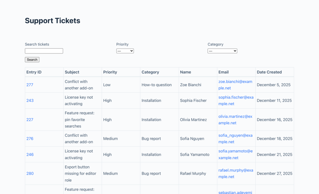
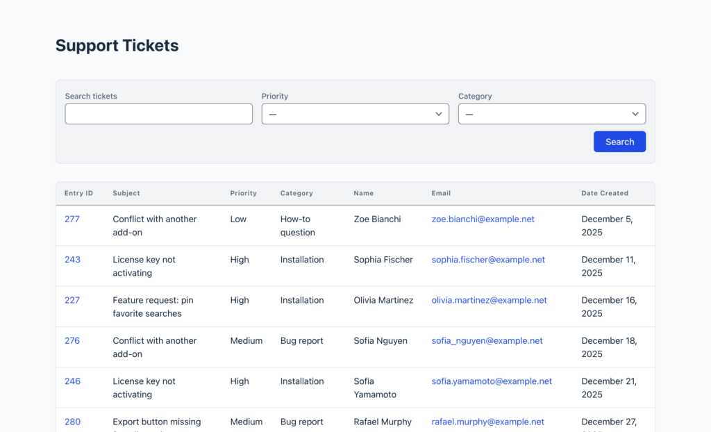
Vantage isn’t only for the List layout. Because it works with every layout, you can apply it to a Table View too, and it refreshes the table’s appearance without changing your columns or your data. The rows and columns stay exactly where they are; Vantage simply cleans up the search bar, borders, spacing, and links to match the fresher look.
Here is a Table View on the Legacy theme, showing the classic table appearance:
And here is the same Table View with Vantage applied. Notice the refreshed search bar with its rounded panel and bottom-right Search button, the lighter table borders, and the roomier row spacing, while the columns stay exactly as they were:
How the grid behaves on different screens #
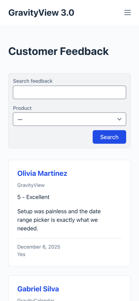
Vantage is responsive. On larger screens, your entries display in the number of columns you set with Columns. On smaller screens the grid adapts, and on phones it stacks into a single column so each card stays readable. You don’t need media queries or custom breakpoints for this to happen.
Fine-tuning with custom CSS #
For anything beyond the Theme, Columns, and Equal Height settings, Vantage is built to be customized. It exposes CSS custom properties (design tokens) that front-end developers can override to adjust colors, spacing, and more without fighting the theme’s styles. When you need your own rules, add them in the Custom CSS box on the View’s Custom Code tab, where your CSS is scoped to this View so it won’t affect other Views or content elsewhere on the page.
Tips and notes #
- A single column is the default, and it’s a perfectly good way to use Vantage. The card grid is entirely opt-in.
- Vantage works with every layout and adapts to your theme’s colors and fonts.
- It works with your existing field configuration, so you don’t need to rebuild your View to use it.
- Existing Views keep the Legacy theme until you switch them to Vantage, so upgrading to GravityView 3.0 won’t change how your current Views look.
Note: Themes are a GravityView 3.0 feature. If you don’t see the Styles tab or the Theme picker, update GravityView to the latest version.