
Styling the Search Bar widget
Every element of the Search Bar has a class name, so you can restyle all of it with CSS: the fields, their names, the buttons, and the Advanced Search section.
Where to put the CSS #
The usual place is the View itself. In the View editor, open the Custom Code tab of the Settings box and add your rules to the Custom CSS field. They load only on pages where that View renders, and GravityView limits each rule to that View, so a rule like .gv-search-button { … } changes this View’s button and no other. Since GravityView 3.8.0, GravityView gives these rules the weight of two IDs, so they win over GravityView’s own styles, the Vantage theme’s included, without !important. Adding custom CSS to your Views describes the field. The VIEW_WRAPPER placeholder stands for the View’s outer wrapper, for example VIEW_WRAPPER .gv-widget-search { … }. The VIEW_SELECTOR placeholder doesn’t reach the Search Bar, because it matches only the part of the View that holds the entries. Rules meant for every View on the site belong in your theme’s stylesheet or in the Customizer’s Additional CSS.
To style one field and leave the others alone, give it a class of its own. Every search field has a Custom CSS Class setting, and the class lands on that field’s container.
How the search bar is built #
Every search field renders the same way, so one search bar shows all the parts. The numbers match the list below.
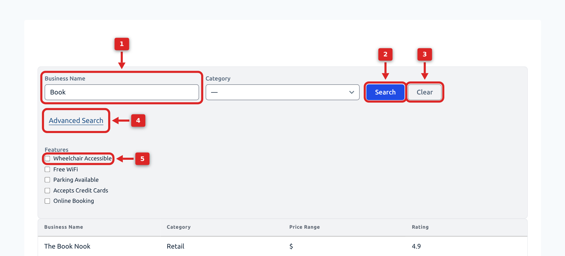
- A field: a
.gv-search-boxwith a second class for its type,gv-search-field-texthere. Its name is on top and its input below. The Custom CSS Class setting adds your class to this box. - The Search button:
.gv-search-button. - The Clear link:
.gv-search-clear. It appears once a search is active, when the Clear option is on. - The Advanced Search link:
#gv-search-advanced-toggle. It opens#gv-search-advanced, which holds the fields placed in the Advanced section. - A choice in a radio or checkbox field: a
<label class="gv-check-radio">wrapping its input.
The whole bar is a <form class="gv-widget-search">. The fields that are always visible are in .gv-widget-search-general-search, and the Advanced ones in #gv-search-advanced. In markup, a field looks like this:
<form class="gv-widget-search">
  <div class="gv-widget-search-general-search gv-grid">
    <div class="gv-search-box gv-search-field-text my-class">
      <label for="search-box-filter_3">City</label>
      <p><input type="text" id="search-box-filter_3"></p>
    </div>
  </div>
  <div id="gv-search-advanced">…</div>
</form>The field name is a <label>. Fields that hold several inputs (radio buttons, checkboxes, date and number ranges) use a <label> too in GravityView 3.4.0 and earlier, and a <fieldset> with a <legend> in later releases, so name both in your selectors: .gv-search-box label, .gv-search-box legend.
Selectors by field type #
Combine the wrapper class with the input selector: .gv-search-field-select select, .gv-search-field-radio input[type="radio"], and so on. The wrapper class on its own styles the whole field, name included.
| Field | Wrapper class | Inside it |
|---|---|---|
| Search Everything | .gv-search-field-search_all | input[type="search"] |
| Text | .gv-search-field-text | input[type="text"] |
| Dropdown | .gv-search-field-select | select |
| Multiselect | .gv-search-field-multiselect | select |
| Radio buttons | .gv-search-field-radio | input[type="radio"], each choice in .gv-check-radio |
| Checkboxes | .gv-search-field-checkbox | input[type="checkbox"], each choice in .gv-check-radio |
| Single checkbox | .gv-search-field-single_checkbox | .gv-check-radio (box and name together) |
| Links | .gv-search-box-links | a, the active choice a.active |
| Number range | .gv-search-number-range | two input[type="number"] |
| Date | .gv-search-date | .gk-calendar-root (the date picker) |
| Date range | .gv-search-field-date_range | .gv-date-picker--start and .gv-date-picker--end, each holding a .gk-calendar-root |
| Entry Date | .gv-search-field-entry_date, plus .gv-search-date-range when it is a range | as Date and Date range |
| Entry ID | .gv-search-field-entry_id | input[type="text"] |
| Chained Selects | .gv-search-field-chainedselect | the Chained Selects field’s own markup |
| Submit | .gv-search-box-submit | .gv-search-button, and .gv-search-clear when the Clear button is on |
| Geolocation (Maps) | .gk-search-geolocation-field | .gk-maps-search-geolocation-address-autocomplete (address), .gk-maps-search-current-geolocation (current location button), .gk-maps-search-current-geolocation-radius, .gk-maps-search-current-geolocation-unit |
Examples #
Give text inputs, number inputs, and dropdowns one look:
.gv-widget-search input[type="search"],
.gv-widget-search input[type="text"],
.gv-widget-search input[type="number"],
.gv-widget-search select {
  padding: 0.5rem 0.75rem;
  border: 1px solid #ccc;
  border-radius: 6px;
  font-size: 1rem;
}Style the field names on every field type and on both versions of the markup:
.gv-search-box label:not(.gv-check-radio),
.gv-search-box legend {
  font-weight: 600;
  margin-bottom: 0.25rem;
}Put radio and checkbox choices side by side, with a gap between them:
.gv-search-field-radio .gv-check-radio,
.gv-search-field-checkbox .gv-check-radio {
  display: inline-flex;
  align-items: center;
  gap: 0.4rem;
  margin-right: 1rem;
  cursor: pointer;
}The date picker’s colors, border, and corner radius come from custom properties on the picker’s root. The calendar pop-up is attached to the end of the page rather than to the Search Bar, and it reads the same properties:
.gv-search-date .gk-calendar-root {
  --gk-filters-calendar-border: #ccc;
  --gk-filters-calendar-control-radius: 6px;
  --gk-filters-calendar-accent: #0073aa;
  --gk-filters-calendar-accent-hover: #005e8c;
}Style the Search button and the Clear link next to it:
.gv-search-button {
  background-color: #0073aa;
  color: #fff;
  border: 0;
  border-radius: 6px;
  padding: 0.6rem 1.25rem;
}

.gv-search-clear { margin-left: 1rem; }On a View that uses the Vantage theme, the rule above also stops the button from changing color on hover. Setting the button’s color tokens instead keeps a hover color:
VIEW_WRAPPER {
  --gv-button-bg: #0073aa;
  --gv-button-bg-hover: #005e8c;
  --gv-button-color: #fff;
}The Advanced Search link and the section it opens can be styled too. Change the section’s spacing and borders, and leave display alone, since GravityView shows and hides the section through the gv-search-advanced--open class:
#gv-search-advanced-toggle {
  display: inline-block;
  margin-top: 1rem;
}

#gv-search-advanced {
  padding-top: 1rem;
  border-top: 1px solid #eee;
}To style one field only, give it a class through its Custom CSS Class setting. Here the field has the class city-filter:
.gv-search-box.city-filter {
  max-width: 240px;
}

.gv-search-box.city-filter input[type="text"] {
  text-transform: uppercase;
}For the Maps geolocation field, style the address box and the current location button beside it:
.gk-maps-search-geolocation-address-autocomplete {
  padding: 0.5rem;
  border: 1px solid #ccc;
  border-radius: 6px;
}

.gk-maps-search-current-geolocation {
  background: none;
  border: 0;
}When a rule has no effect #
Note: On Views that use the Vantage theme, GravityView’s Search Bar rules start with .gv-themed and chain several classes, five for the Search button. A rule in your theme’s stylesheet needs more weight than that to win. A .gv-themed in front of the rule is enough for some rules, such as .gv-themed .gv-search-box label, and not for others, such as the Search button or the border of a text box. Where a theme rule has no effect, move it to the View’s Custom CSS field. Leave .gv-themed out of Custom CSS: the View’s own wrapper has that class, so a rule there that starts with it matches nothing.
Note: Write selectors without the element name, .gv-search-box rather than div.gv-search-box. Grouped fields render as a <fieldset> in newer releases, and a selector tied to div stops matching them.