Published
•
Updated
Announcing Elementor integration for GravityView: Visual styling for your Views made simple
We’re excited to release the GravityView Advanced Elementor Widget, a new way to design beautiful Views using Elementor’s visual interface. Elementor powers more WordPress sites than any other page builder, so a native styling widget was an obvious next step. If you’ve ever wanted to customize the appearance of your Views beyond what’s possible in…
We’re excited to release the GravityView Advanced Elementor Widget, a new way to design beautiful Views using Elementor’s visual interface. Elementor powers more WordPress sites than any other page builder, so a native styling widget was an obvious next step. If you’ve ever wanted to customize the appearance of your Views beyond what’s possible in the View editor but didn’t want to write custom CSS, this widget is for you.
The Advanced Elementor Widget brings together GravityView’s powerful data display capabilities with Elementor’s intuitive design tools, giving you complete visual control over every aspect of your Views, without needing code!
See the complete guideFor the full walkthrough on using Gravity Forms with Elementor, including the free Gravity Forms Widget for Elementor, configuration, styling, and FAQs, read how to add Gravity Forms to Elementor (complete guide).
Basic and advanced Elementor widgets
GravityView users will have access to the basic widget which enables you to embed Views into any Elementor page and configure basic settings (this is coming soon!). GravityView Pro and All Access users have immediate access to the advanced widget which includes extensive styling options and responsive controls.
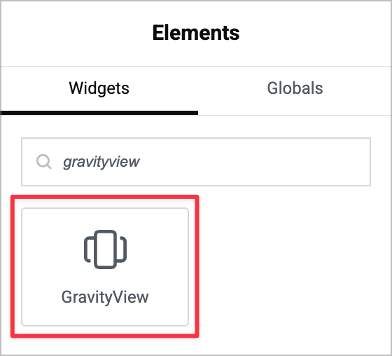
Embed Views with drag-and-drop simplicity
Getting started is as simple as adding any other Elementor widget. Just search for “GravityView” in the Elementor sidebar, drag the widget onto your page, and select which View you want to display from the dropdown menu.
All the standard GravityView settings you’re familiar with (like entries per page, search options, and user editing permissions) are available right in the widget’s Content tab. You can adjust these settings directly in Elementor without switching between screens or leaving the visual builder.
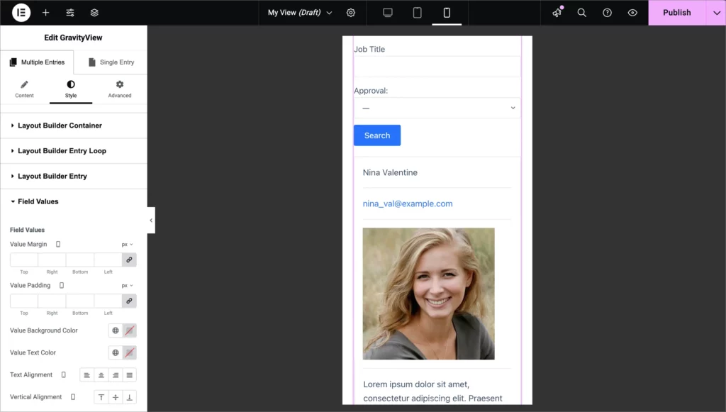
Granular styling control for every element
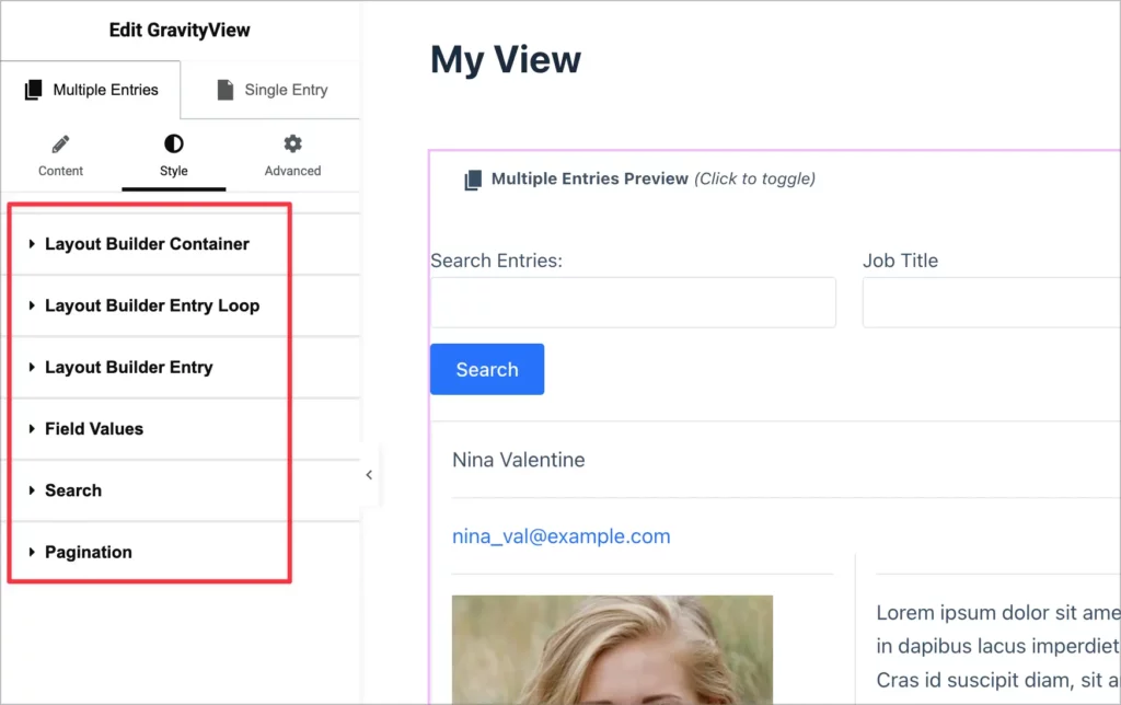
Here’s where things get exciting. The Style tab gives you precise control over every part of your View. First, you can toggle between the Multiple Entries and Single Entry pages and adjust styles for each independently.
Second, depending on the layout your View is using (e.g., List, Table, Layout Builder), you’ll see dedicated styling options for each section.
For example:
- Container – Control the overall wrapper and background
- Entry Loop – Style the repeating entry cards or rows, including entries per row and spacing
- Individual Field Zones – Fine-tune the appearance of specific field areas
Elementor’s powerful visual styling controls enable you to tweak visual elements including:
- Text and background colors – Apply your brand colors throughout
- Spacing and padding – Adjust margins and padding for pixel-perfect layouts
- Typography – Control font sizes, weights, and styles
- And much more!
The styling follows a cascading hierarchy similar to CSS. Set a text color at the container level and it applies to everything inside, then override it for specific elements when needed. This makes it easy to create cohesive designs quickly while maintaining flexibility for detailed customization.
Find what you need instantly
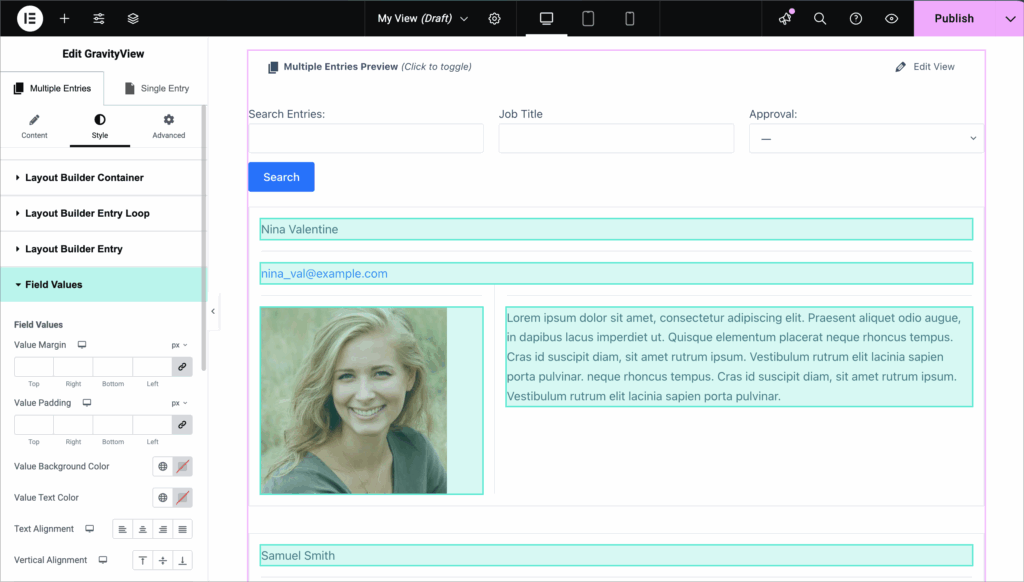
We’ve added two features that make styling effortless: hover preview and click-to-edit.
When you hover over any section in the Style tab, the corresponding element highlights on your View. This makes it incredibly easy to identify which setting controls which element—no more guessing or trial and error.
Even better, you can click directly on any element in the preview and Elementor will automatically open its corresponding style settings. It’s the fastest way to style exactly what you want.
Build responsive designs for every device
Your Views should look great on desktop, tablet, and mobile. Elementor’s responsive controls make this simple.
Switch between device previews at the top of the interface and adjust styles for each screen size independently. For example, you might display four entries per row on desktop but switch to a single column on mobile for better readability. Reduce padding on smaller screens, adjust font sizes, or completely change the layout—whatever works best for your design.
Each device size maintains its own styles, ensuring your Views look perfect everywhere.
Supported layouts
The GravityView Elementor extension supports most of our layouts out of the box:
- List Layout
- Table Layout
- DIY Layout
- Maps Layout
- Layout Builder
Support for DataTables Layout is coming soon. Each layout has its own tailored style options that match its unique structure.
Create professional designs in minutes
What used to require custom CSS and developer knowledge can now be done visually in minutes. Here’s a quick example:
Say you have a member directory View that looks plain and basic. With the Elementor extension, you can transform it into a sleek, modern layout:
- Adjust the entries per row to create a grid layout (4 columns on desktop, 1 on mobile)
- Add a background color to the container
- Style individual member cards with subtle box shadows
- Update text colors for readability
- Fine-tune spacing and padding
The result? A professional-looking member directory that matches your brand—and you didn’t write a single line of CSS.
Available now for GravityView Pro users
The Advanced Elementor Widget is available now. If you’re already using GravityView and Elementor, download the extension from the “Manage Your Kit” page in WordPress and start designing!
We’d love to see what you create with the new visual styling capabilities. Share your Views with us on Twitter or via our support desk. We can’t wait to see what you build!
Helpful tips right in your inbox.
Subscribe to get the latest articles, information on releases and helpful Gravity Forms tips!
More articles
10 things you can ask AI to do with Gravity Forms (using the free GravityKit MCP)
See 10 practical things you can ask AI to do with Gravity Forms using the free GravityKit MCP: create forms, manage entries, build Views, and more.

Launch Log: theme template editing in Block MCP, Shield silentCAPTCHA for Zero Spam, and GravityView fixes
Block MCP adds safe theme template editing, Gravity Forms Zero Spam gains Shield silentCAPTCHA support, and GravityView fixes lightbox and notice bugs.

GravityKit turns 12: a year in review, and 30% off Lifetime All Access
GravityKit turns 12. A look back at a year of GravityView 3.0, GravitySearch, and AI-assisted building, plus a birthday sale on the Lifetime All Access Pass.