
Plotting data against time
GravityCharts allows you to plot data against time. In other words, you can have the date on the X axis and a numerical value on the Y axis. In this article, we will show you how to plot data against time and explain how this functionality works.
Example: Revenue / time #
Here’s an example where we are plotting revenue in USD (on the Y axis) against the date (on the X axis).

How to create a timeline chart #
When you create a new chart in GravityCharts, you will see the option to “Show on Timeline” under “Data Type” in the “Chart Data” settings panel. After you select this option, you will need to specify the Date field, Data Operation and Data Field. Timelines are available on Bar / Column and Line / Area charts.
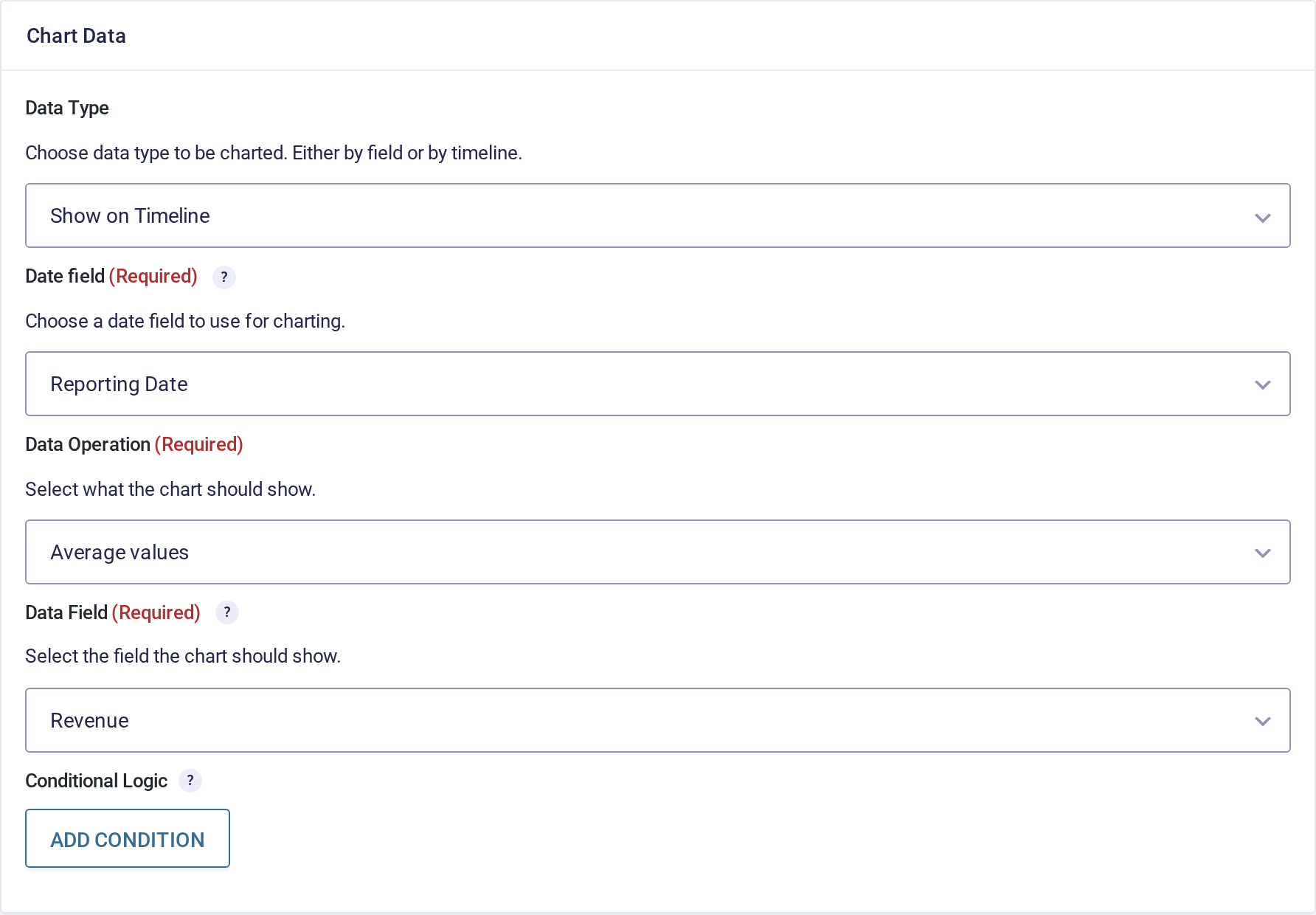
Here’s an overview of the different options in a little more detail:
- Data Type: Plot data by field (default) or on a timeline.
- Date field: Select the date field that should be used for the X axis. You can choose between the entry date or a specific “Date” field in your form. Only date fields are offered here.
- Data Operation: Choose between “Entry count”, “Sum values”, “Average values”, “Maximum value” or “Minimum value”.
- Data Field: The field you want to plot on the Y axis. Needed for every operation except “Entry count”, which simply counts the entries received per date.
Timeline options #
When you open the “Axis” drop down, you will see the option to adjust the timeline scale and labels. You can set the scale to either “Day”, “Week”, “Month”, “Quarter” or “Year”. The same panel has Display Overlapping Labels and Exclude Empty Labels, which control what happens when labels collide or have nothing to show.
By default, the timeline labels option is set to “Automatic”, meaning that all dates, irrespective of whether they have corresponding entries, will be displayed on the X axis, for the period of time between the first and last entry. If you set this option to “Data points only”, then only the dates with entries will show up as labels on the X axis.
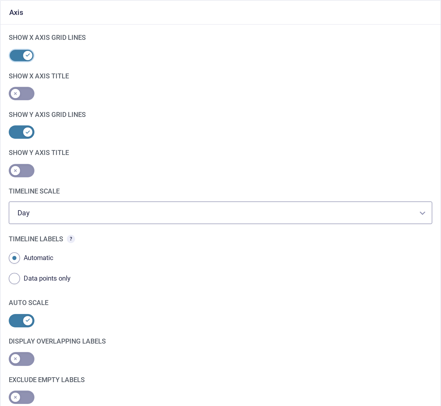
The chart preview will update in real-time as you make changes, so feel free to experiment with different options and configurations to get the graph you want.
Limitations for plotting data against time #
When plotting data against time, you have the option to plot the entry count by date, or the sum or average of a specific field by date. You cannot yet plot multiple datasets on a single chart.
The Data Field accepts Number fields, and also Drop Down, Multi-Select, Radio Buttons, Checkboxes and List fields whose choices carry numeric values. Values that are not numeric are ignored.