
Chart Design and Styling
GravityCharts includes an extensive range of customization options that allow you to tweak the look and feel of your charts before setting them live on your site.
After editing your GravityCharts feeds, you’ll find the style options in the Chart Configuration panel above the chart preview. There are five design menus: “Colors”, “Design”, “Title & Legend”, “Axis” and “Labels”.
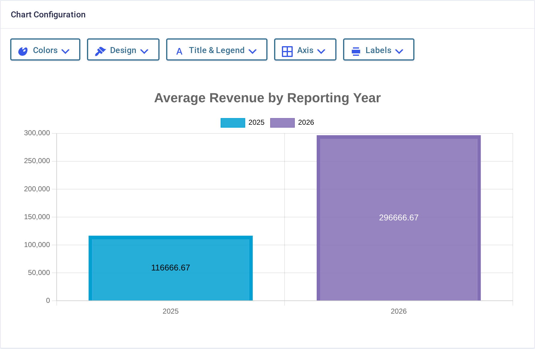
Click on one of the design tabs to see the available options. After opening one of the tabs, you can click to drag and drop the panel anywhere on your screen.
Here’s an overview of the different options within each of the style tabs:
- Colors: Select a color scheme for your chart from our predefined color palettes.
- Design: Here, you’ll find design options specific to your chosen chart type, including border width, line thickness, etc.
- Title & Legend: Enable the Chart Title and Legend and change their position.
- Axis: Enable auto-scaling, show/hide the grid lines, and control how labels behave when they overlap or have nothing to show.
- Labels: Print the value, the choice label or a percentage onto each bar or slice. See Adding data labels to a chart.
To use your own brand colors, add a palette with a code snippet. See Adding a new color palette.
Not every menu applies to every chart type. Pie and doughnut charts have no axes, so they have no Axis menu, and radar charts don’t support data labels.