Published
•
Updated
Feature highlight: Plotting data against time using GravityCharts
GravityCharts supports plotting Gravity Forms data against time for trend analysis and timeline charts. Visualize how submission data changes over days, weeks, months, or years.
In this edition of Feature Highlights, we’re going to delve into plotting data against time using GravityCharts! This exciting feature allows you to create timeline charts for more in-depth data analysis and trend discovery.
This functionality extends the capabilities of GravityCharts by allowing you to visualize how your data changes over time. Let’s take a look!
Learn more about GravityCharts, or check out our live demo to see what’s possible with this powerful plugin!
Why plot data against time?
Plotting data against time has become an essential aspect of data visualization in today’s digital era. Time-based data charts offer invaluable insights into trends, patterns, and relationships that evolve over time.
Whether analyzing stock market fluctuations, tracking user engagement metrics, or monitoring climate change, plotting data against time provides a clear and intuitive representation of how variables change and interact within a specific timeframe.
This enables researchers, analysts, and decision-makers to identify correlations, forecast future trends, and make informed data-driven decisions.
With this new feature introduced in GravityCharts, users can now effortlessly create dynamic timeline charts, unlocking a wealth of knowledge from their data!
How to plot data against time
Plotting against time in GravityCharts is simple, all you need is a form with one or more of the following supported fields: “Number”, “Radio Buttons”, “Checkboxes”, and “Drop Down”. All Pricing fields, such as “Product”, and “Total”, are also supported.
After creating a new chart and selecting a chart type, scroll down and select “Show on Timeline” under “Data Type”. After that, several other fields will appear, allowing you to configure your timeline chart.
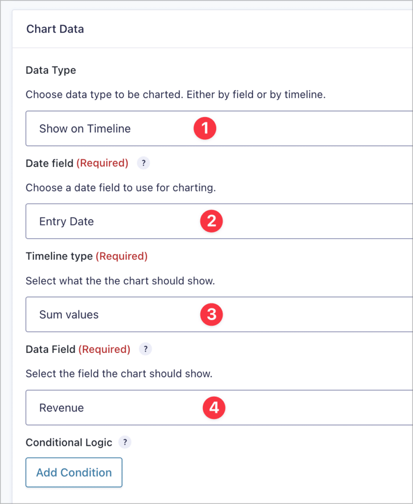
- Data type: Chose whether you want to plot your data by field (default) or on a timeline.
- Date field: Select the date field that should be used for the X axis. You can choose between the entry date or a specific “Date” type field in your form.
- Timeline type: Choose how you want individual values to be handled. The options are “sum values”, “average values” or “entry count”.
- Data field: If the “Timeline type” is set to “sum values” or “average values”, you will need to specify a form field here with numerical data (this is the field you want to plot on the Y axis). If you selected “entry count” as your timeline type, there is no need to select a data field, as GravityCharts will simply retrieve the number of entries received per date and plot that number!
After selecting your fields and timeline type, you can scroll down to the chart preview to begin styling your new chart! If you open the “Axis” style menu, you will see some options specific to timeline charts.
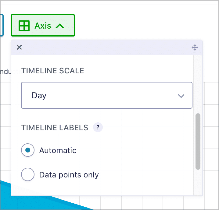
The first option is “Timeline scale”. This allows you to adjust the scale of the x-axis, as well as the labels. You can set the scale to either “Day”, “Week”, “Month”, “Quarter” or “Year”.
By default, the timeline labels option is set to “Automatic”, meaning that all dates, irrespective of whether they have corresponding entries, will be displayed on the X axis for the period of time between the first and last entry. However, if you set this option to “Data points only”, then only the dates with entries will show up as labels on the X axis!
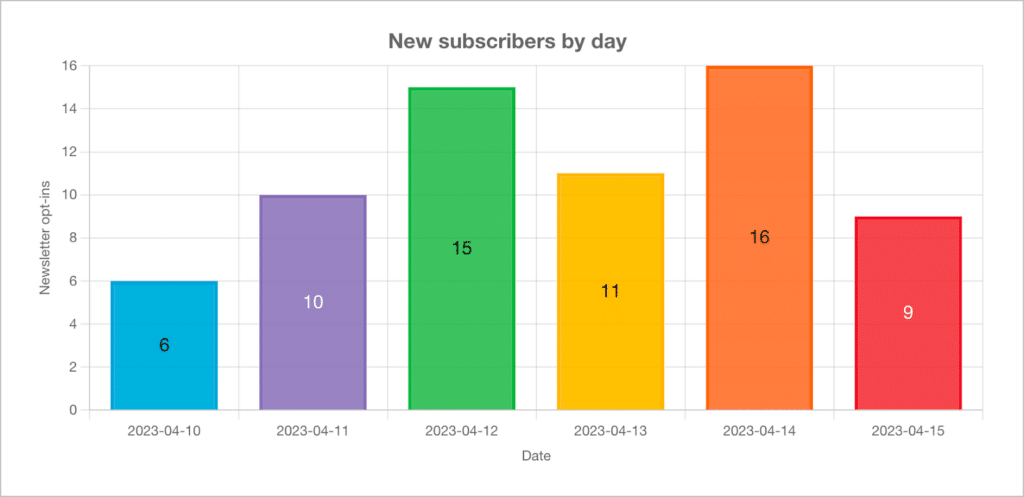
Here’s an example of a bar chart showing the umber of new subscribers per day.
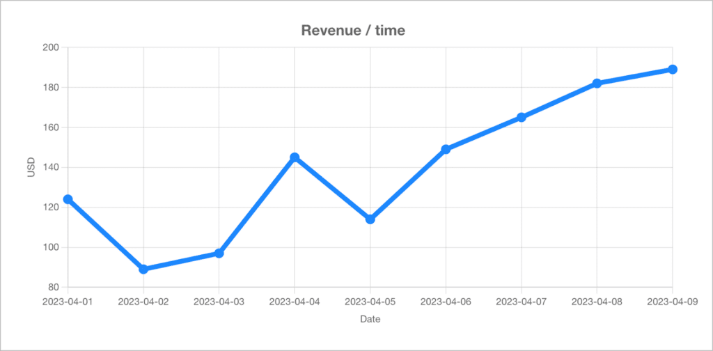
Here’s a second example—a line chart displaying the revenue generated per day.
Now let’s take a look at some common use cases for timeline chart.
Common business use-cases for timeline charts
Customer engagement metrics: Tracking customer engagement metrics, such as website visits, click-through rates, or social media interactions, over time helps businesses assess the effectiveness of marketing campaigns!
Project timelines: Visualizing project milestones and tasks against time is crucial for project management. This allows project managers to monitor progress, identify bottlenecks, and ensure tasks are completed on time.
Financial performance: Businesses can plot financial data against time to monitor key performance indicators (KPIs) such as revenue, expenses, and profit margins. This enables them to identify trends, and make more informed decisions.
Customer satisfaction and feedback: Monitoring customer satisfaction scores, feedback ratings, or survey responses over time provides valuable insights into the overall customer experience. Plotting this data allows businesses to evaluate the impact of changes made to products or services.
Get started with timeline charts!
GravityCharts is a powerful add-on for Gravity Forms that allows you to create charts and graphs from your form data. You can now also plot data against time by using the entry date or a specified date field in your form!
With timeline charts, you can showcase how your data changes over time, giving you more ways to create helpful visuals using your form data. So what are you waiting for? Learn more about GravityCharts today!

Helpful tips right in your inbox.
Subscribe to get the latest articles, information on releases and helpful Gravity Forms tips!
More articles
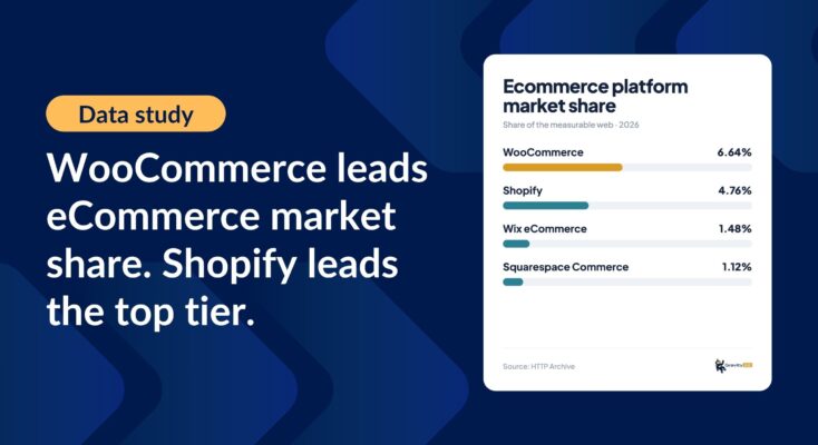
Ecommerce platform market share 2026: WooCommerce leads the web, Shopify leads the top tier
Ecommerce platform market share in 2026, from HTTP Archive data. WooCommerce leads the whole web at 6.64%, but Shopify already leads the top 1M sites.

Launch Log: 3D map enhancements, smarter filtering, and improved performance on large data sets
GravityKit’s July 9 launch log: 3D map starting views and viewport loading, searchable field-to-field filtering, and fixes across DataTables and more.

How to build a conference website on WordPress (attendee registration + abstract submission)
Build a conference registration and abstract submission site on WordPress with GravityKit, no code: forms, an attendee directory, sessions, and PDF certificates.