Published
•
Updated
How to style the buttons on GravityView’s Edit Entry page
Customize the Update, Cancel, and Delete buttons on the GravityView Edit Entry page using CSS. Includes copy-paste examples that work with any WordPress theme.
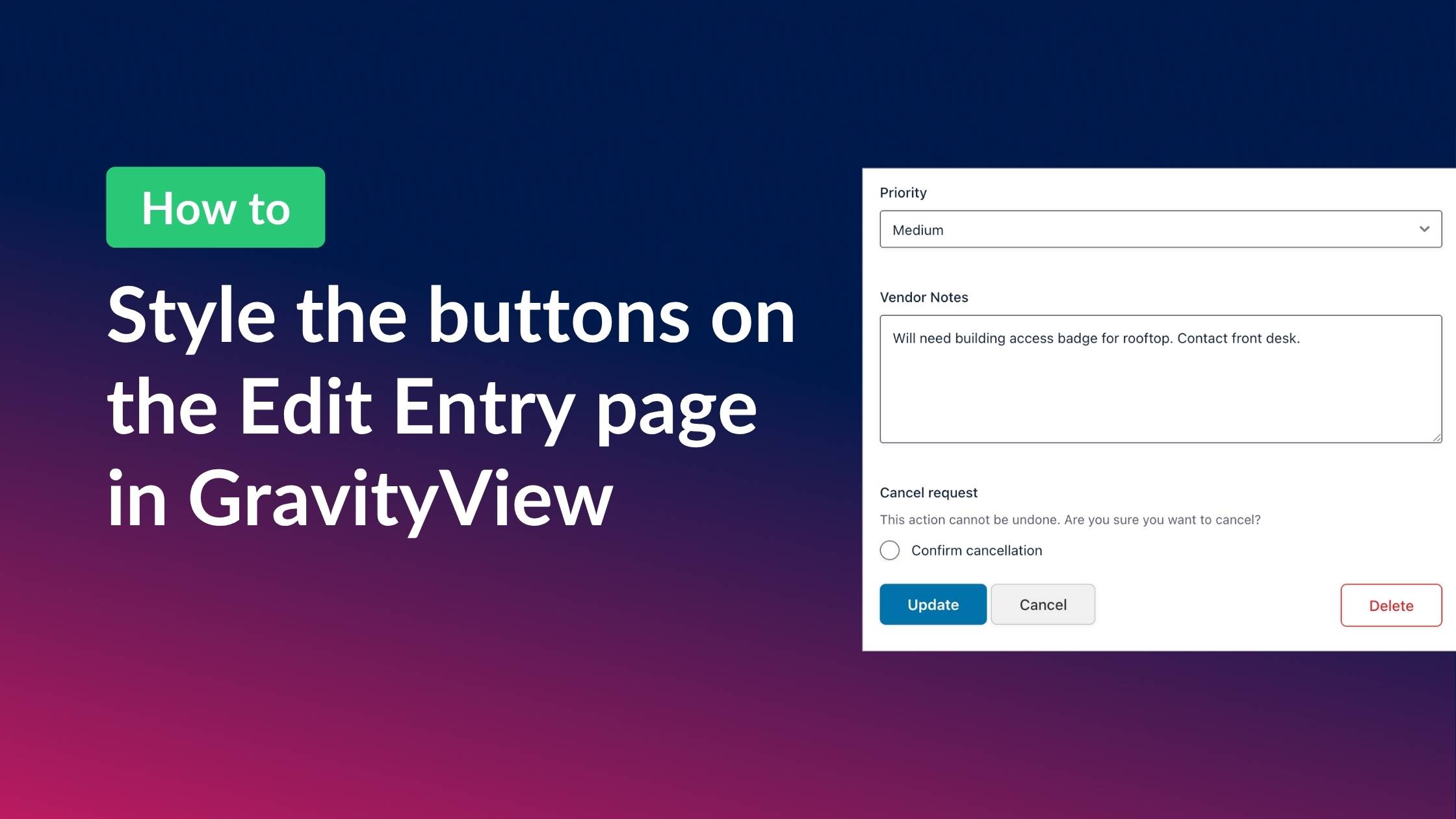
GravityView’s Edit Entry page contains three buttons: “Update”, “Cancel”, and “Delete”. We’ve added common CSS classes to make them look consistent across themes, but depending on your theme, the buttons may appear unstyled or not match the rest of your site.
The good news is that with a little CSS, you can customize them however you want —and you don’t need to be a CSS expert to do it! In this post, I’ll show you how to style the buttons on the GravityView Edit Entry page, complete with several examples that you can copy/paste.
Let’s dive in.
Wanna try it?
Spin up a demo
See what you can build with GravityView — explore the live demo.
GravityView CSS reference guide
Whenever you want to add custom styles to a GravityView element, you can check our handy CSS Guide to see which classes to target.
If we open the guide and scroll down to the “Edit Entry” section, we can see that all of the buttons are contained inside of a <div> with an id of #publishing-action.
The buttons themselves have several classes, including some common CSS classes used by popular WordPress themes. That’s why they may already have some styling applied to them.
For our custom styles, we’re going to target the following classes:
- Update:
.gv-button-update - Cancel:
.gv-button-cancel - Delete:
.gv-button-delete
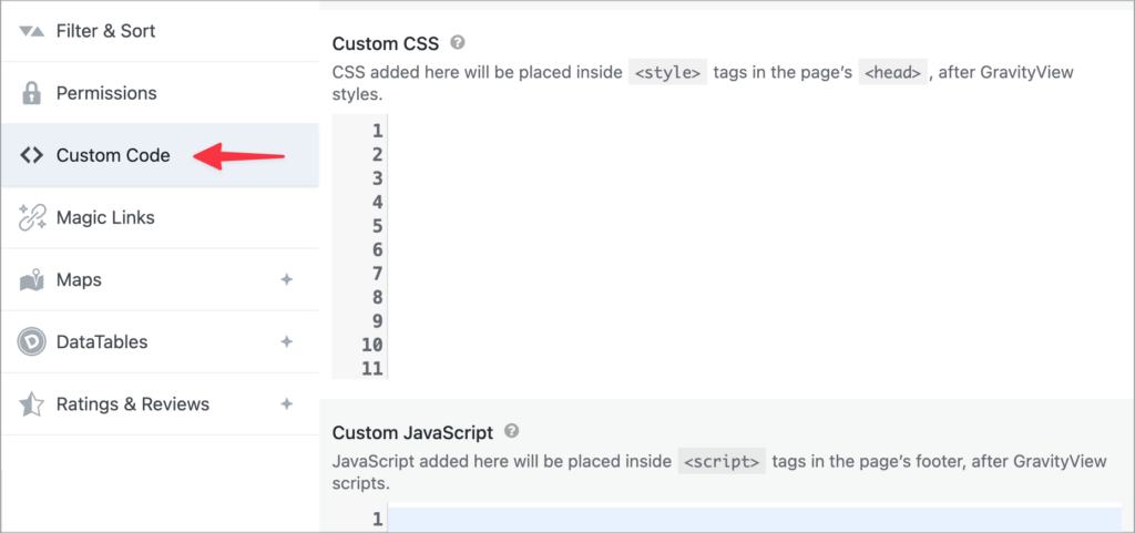
How to add custom CSS to a View
Every View you create in GravityView has its own Custom Code settings where you can add your own CSS and JS code. While there are other ways to add custom CSS to a View, this is the recommended method. Simply edit your View, scroll down to the View settings, and click on Custom Code.
Button style CSS examples (copy/paste ready)
Here are four copy-and-paste CSS templates you can use right away. To add them to your site, edit your View, scroll down to the View settings, click on Custom Code, and paste them into the Custom CSS box.
Option 1: Clean and modern
A polished look with rounded corners, consistent spacing, and subtle hover effects.
/* Clean and modern button styles */
#publishing-action .gv-button-update {
    background-color: #0073aa;
    color: #ffffff;
    padding: 12px 28px;
    margin-right: 10px;
    border: none;
    border-radius: 6px;
    font-size: 15px;
    font-weight: 600;
    cursor: pointer;
    transition: background-color 0.2s ease;
  }

#publishing-action .gv-button-update:hover {
    background-color: #005a87;
  }

#publishing-action .gv-button-cancel {
    background-color: #f0f0f0;
    color: #333333;
    padding: 12px 28px;
    margin-right: 10px;
    border: 1px solid #cccccc;
    border-radius: 6px;
    font-size: 15px;
    text-decoration: none;
    transition: background-color 0.2s ease;
  }

#publishing-action .gv-button-cancel:hover {
    background-color: #e0e0e0;
  }

#publishing-action .gv-button-delete {
    background-color: transparent;
    color: #d32f2f;
    padding: 12px 28px;
    border: 1px solid #d32f2f;
    border-radius: 6px;
    font-size: 15px;
    text-decoration: none;
    transition: all 0.2s ease;
  }

#publishing-action .gv-button-delete:hover {
    background-color: #d32f2f;
    color: #ffffff;
}Option 2: Minimalist, text-style
A lightweight design where Cancel and Delete appear as text links, keeping the focus on the Update button.
/* Minimal text-style buttons */
#publishing-action .gv-button-update {
    background-color: #1a1a1a;
    color: #ffffff;
    padding: 10px 24px;
    margin-right: 16px;
    border: none;
    border-radius: 4px;
    font-size: 14px;
    font-weight: 600;
    cursor: pointer;
    transition: background-color 0.2s ease;
  }

#publishing-action .gv-button-update:hover {
    background-color: #333333;
  }

#publishing-action .gv-button-cancel {
    background: none;
    color: #666666;
    padding: 10px 8px;
    border: none;
    font-size: 14px;
    text-decoration: underline;
    text-underline-offset: 3px;
  }

#publishing-action .gv-button-cancel:hover {
    color: #1a1a1a;
  }

#publishing-action .gv-button-delete {
    background: none;
    color: #999999;
    padding: 10px 8px;
    border: none;
    font-size: 13px;
    text-decoration: none;
  }

#publishing-action .gv-button-delete:hover {
    color: #d32f2f;
    text-decoration: underline;
}Option 3: High-contrast
A high-visibility design with strong colors and to make each action unmistakable.
/* Bold high-contrast button styles */
#publishing-action .gv-button-update {
    background-color: #2e7d32;
    color: #ffffff;
    padding: 14px 32px;
    margin-right: 12px;
    border: none;
    border-radius: 8px;
    font-size: 16px;
    font-weight: 700;
    cursor: pointer;
    box-shadow: 0 2px 4px rgba(0, 0, 0, 0.15);
    transition: all 0.2s ease;
  }

#publishing-action .gv-button-update:hover {
    background-color: #1b5e20;
    box-shadow: 0 4px 8px rgba(0, 0, 0, 0.2);
    transform: translateY(-1px);
  }

#publishing-action .gv-button-cancel {
    background-color: #f5f5f5;
    color: #424242;
    padding: 14px 32px;
    margin-right: 12px;
    border: 2px solid #bdbdbd;
    border-radius: 8px;
    font-size: 16px;
    font-weight: 600;
    text-decoration: none;
    transition: all 0.2s ease;
  }

#publishing-action .gv-button-cancel:hover {
    border-color: #757575;
    background-color: #eeeeee;
  }

#publishing-action .gv-button-delete {
    background-color: #c62828;
    color: #ffffff;
    padding: 14px 32px;
    border: none;
    border-radius: 8px;
    font-size: 16px;
    font-weight: 600;
    text-decoration: none;
    box-shadow: 0 2px 4px rgba(0, 0, 0, 0.15);
    transition: all 0.2s ease;
  }

#publishing-action .gv-button-delete:hover {
    background-color: #b71c1c;
    box-shadow: 0 4px 8px rgba(0, 0, 0, 0.2);
}Option 4: Soft, rounded pills
A friendly, approachable style with pill-shaped buttons and pastel tones.
/* Soft pill button styles */
#publishing-action .gv-button-update {
    background-color: #4a90d9;
    color: #ffffff;
    padding: 12px 32px;
    margin-right: 10px;
    border: none;
    border-radius: 50px;
    font-size: 15px;
    font-weight: 600;
    cursor: pointer;
    transition: background-color 0.2s ease;
  }

#publishing-action .gv-button-update:hover {
    background-color: #357abd;
  }

#publishing-action .gv-button-cancel {
    background-color: #e8edf2;
    color: #4a5568;
    padding: 12px 32px;
    margin-right: 10px;
    border: none;
    border-radius: 50px;
    font-size: 15px;
    text-decoration: none;
    transition: background-color 0.2s ease;
  }

#publishing-action .gv-button-cancel:hover {
    background-color: #d5dce6;
  }

#publishing-action .gv-button-delete {
    background-color: #fde8e8;
    color: #c53030;
    padding: 12px 32px;
    border: none;
    border-radius: 50px;
    font-size: 15px;
    text-decoration: none;
    transition: all 0.2s ease;
  }

#publishing-action .gv-button-delete:hover {
    background-color: #fbd5d5;
  }
Pro Tip
You can mix and match elements from different templates. For example, use the pill-shaped buttons from the Soft template with the color scheme from the Bold template!
Using AI to write custom button styles
If you have a specific design in mind, you can use an AI tool like ChatGPT or Claude to generate the CSS for you. Copy the prompt below, fill in the description of your desired style, and paste it into your AI tool of choice.
I need CSS to style the buttons on a GravityView Edit Entry page in WordPress.

Here is the HTML structure of the buttons:

<div id="publishing-action">
  <input class="gv-button-update" type="submit" value="Update" />
  <a class="gv-button-cancel" href="#">Cancel</a>
  <a class="gv-button-delete" href="#">Delete</a>
</div>

Please write CSS that:
- Targets only the #publishing-action container (so it doesn't affect other buttons on the page)
- Includes hover states for all three buttons
- Makes the Delete button visually distinct as a destructive action
- [DESCRIBE YOUR DESIRED STYLE HERE, e.g., "matches my site's blue and white color scheme with rounded corners" or "looks like Material Design buttons"]

The CSS will go in WordPress Appearance > Customize > Additional CSS.Making Edit Entry buttons responsive on mobile
The CSS examples above use fixed padding (15px 32px), which can cause buttons to overflow or get cut off on smaller screens. Adding a media query ensures the buttons stack vertically and remain tappable on mobile devices:
@media screen and (max-width: 600px) {
    #publishing-action .gv-button-update,
    #publishing-action .gv-button-cancel,
    #publishing-action .gv-button-delete {
        display: block;
        width: 100%;
        text-align: center;
        padding: 12px 16px;
        margin: 10px 0 0 0 !important;
        box-sizing: border-box;
        float: none;
    }
}
This snippet makes each button full-width and stacks them vertically when the screen is 600px or narrower.
Targeting specific Views
If you want to have different button styles for different Views, make sure to scope your CSS to the View container.
The easiest way to do this is with GravityView’s built-in CSS placeholders. When editing a View, go to Settings > Custom Code and add your CSS there using these placeholders:
VIEW_SELECTOR– a CSS selector targeting only this View (e.g.,.gv-container.gv-container-47)VIEW_ID– the View ID numberGF_FORM_ID– the connected form ID
GravityView automatically replaces these with the real values when the View is displayed. For example, to style the Update button only in the current View:
VIEW_SELECTOR #publishing-action .gv-button-update {
    background-color: #2196F3;
    color: #ffffff;
}
This becomes .gv-container.gv-container-47 #publishing-action .gv-button-update { } on the front end.
If you prefer to add CSS globally (via Appearance > Customize > Additional CSS), you can use the .gv-container-[View ID] class directly. For example, to style buttons differently in two Views, even if they use the same form:
.gv-container-47 #publishing-action .gv-button-update {
    background-color: #2196F3;
    color: #ffffff;
}

.gv-container-52 #publishing-action .gv-button-update {
    background-color: #FF5722;
    color: #ffffff;
}
For more on GravityView’s CSS structure, see our guide to adding custom CSS to Views.
Wrapping up
Although GravityView generally inherits its styles from your theme, the Edit Entry buttons are one of the most common places where you’ll want to add your own CSS.
In this post, we covered how to target each button class, shared four ready-made templates you can copy and paste, and showed you how to use AI to generate custom styles that match your site. We also covered View-specific targeting and responsive styling for mobile.
Helpful tips right in your inbox.
Subscribe to get the latest articles, information on releases and helpful Gravity Forms tips!
More articles

Launch Log: Distance sorting for radius searches, DataTables search improvements, and import reliability fixes
The latest GravityKit releases add distance sorting to map searches, bring built-in search to DataTables, and fix GravityCharts and GravityImport edge cases.
WordPress page builder market share 2026: Elementor leads at 32.67%
Elementor reaches 32.7% of WordPress sites. WordPress Block Editor 20.6%, wpBakery 8.5%, Divi 5.7%. Latest HTTP Archive crawl, share-of-WordPress basis throughout.

Launch Log: GravityView 3.0, plus upgrades to Block MCP and GravityKit MCP
GravityView 3.0 lands with the new Vantage theme, frontend bulk actions, and AI-assisted View creation. This launch log also covers updates to GravityKit MCP, Block MCP, and Dashboard Views.