Published
•
Updated
How to visualize your Gravity Forms data with charts and graphs
Turn Gravity Forms entry data into charts and graphs using the GravityCharts add-on. Supports bar charts, line charts, radar charts, and more for dashboards and reports.

If you’re a Gravity Forms user, you may be looking for a way to visualize your form data with charts and graphs. If so, look no further!
In this post, I’ll show you, step by step, how to create beautiful visualizations for your Gravity Forms entry data using the powerful GravityCharts add-on. Keep reading to find out how to easily visualize your form data with customizable charts and graphs.
Sneak peek
GravityCharts supports a range of chart types for creating different types of visualizations. Below are a couple of examples.
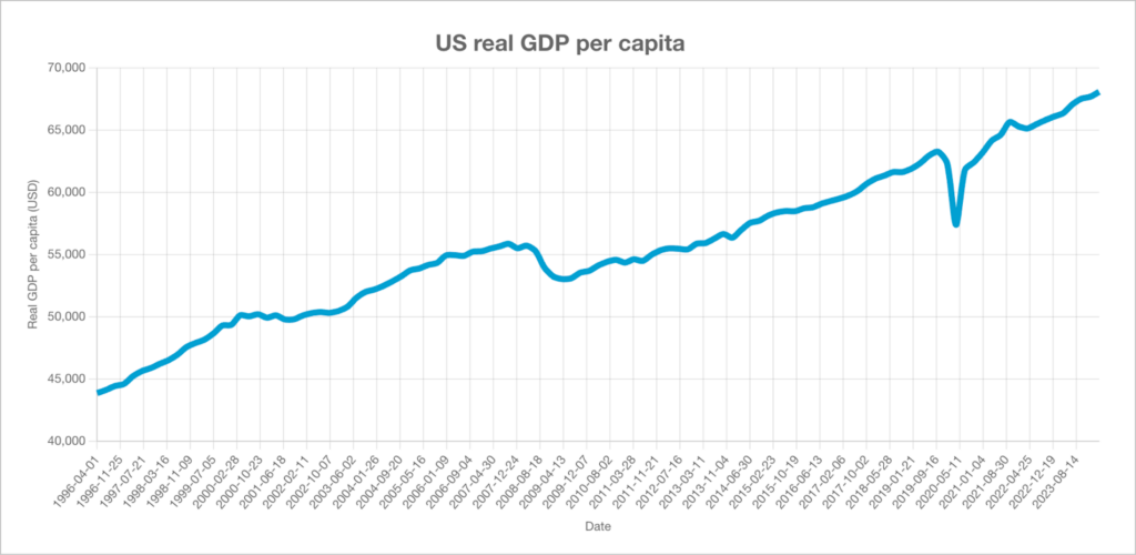
Line charts are helpful for visualizing trends over time, which can be useful when compiling business reports, or creating sales dashboards.

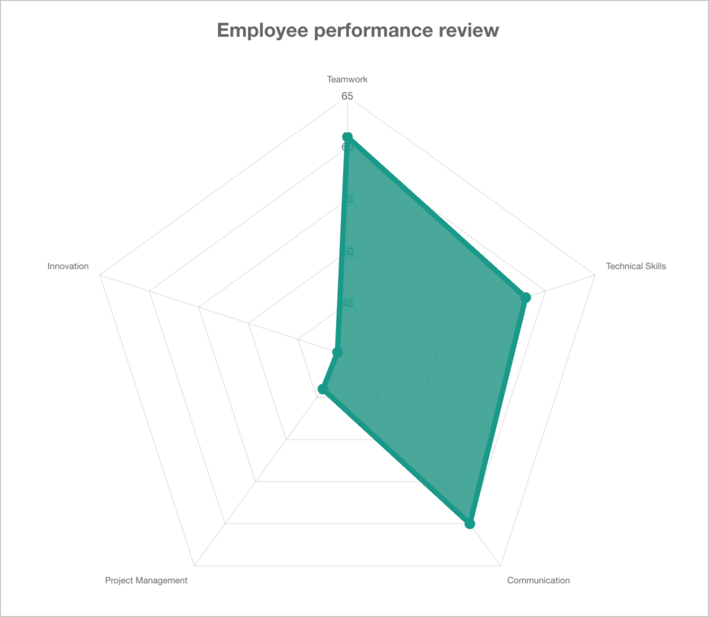
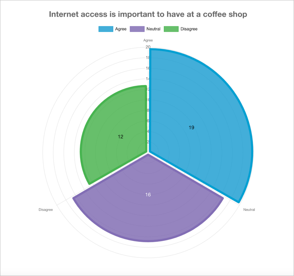
Radar charts help identify patterns, strengths, or areas needing improvement across multiple variables, all at a quick glance.
What is GravityCharts?
GravityCharts is a premium add-on for Gravity Forms that enables you to easily create beautiful visualizations using your form data. GravityCharts supports a range of chart types and includes a wide array of styling options for creating custom charts without any code.
Pro tipTo learn more about GravityCharts you can see our range of live demos here, or sign-up for a free trial site to test out the plugin for yourself!
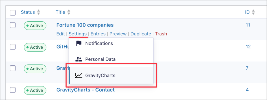
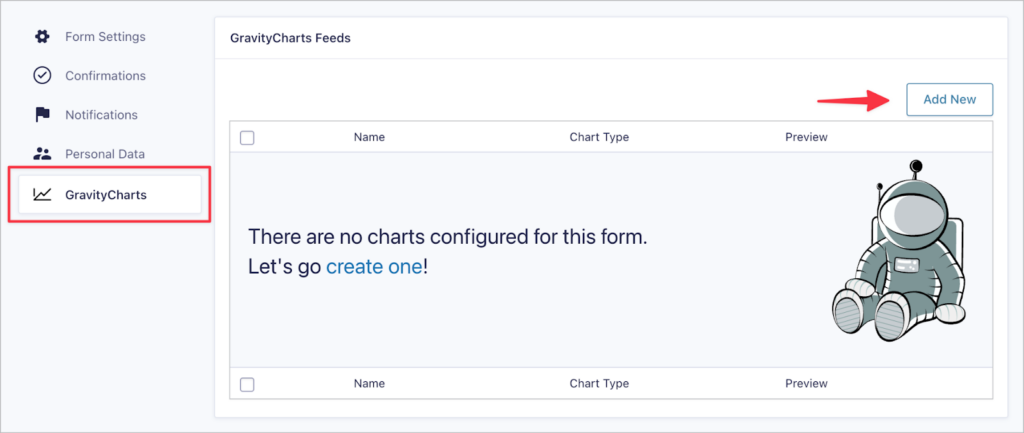
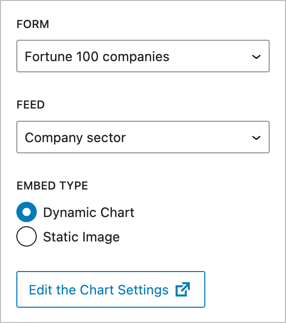
1. Create a new GravityCharts feed
In GravityCharts, each chart displays data from a single form, but you can create as many charts as you want! Start by choosing a form, hover over “Settings” and click “GravityCharts”.
Here you can create a new chart feed by clicking the “Add New” button. After adding a new feed, be sure to give it a name (for reference purposes only).
2. Select a chart type
The next step is to select a chart type. The type of graph you choose will depend on the kind of data you collect and how you want to visualize that data. For this example, we’ll select “Pie / Doughnut”.
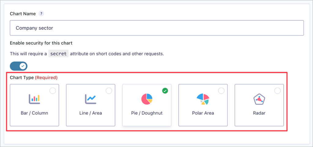
Pro tipLater in the article, I explain how to choose the right chart type for your data.
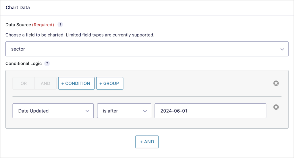
3. Configure the chart
After choosing your chart type, you need to choose what data to display on the chart! You can select a specific form field and add conditional logic filters to ensure you only display the data you need.
I decided to create a pie chart in this example, so my data source is a single categorical form field (in this case, the “Sector” field, showing industry sectors for companies). However, if you choose to create a line chart for example, you’ll also have the option to display numerical values over time.
4. Style the chart
The next step is to configure the chart styles. Here there are several dropdown menus with an extensive array of options for altering the look and feel of your chart. Below that is a chart preview that updates in real-time as you make changes!
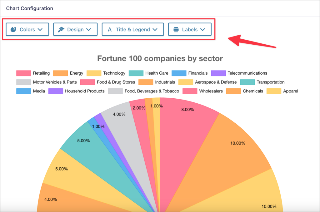
Here’s an overview of the different options available when configuring a pie chart. These will change depending on the chart type you select.
- Colors – Select a color scheme for your chart from one of our predefined color palettes.
- Design – Customize the look of your chart (the options here will depend on the type of graph you selected).
- Title & Legend – Add a title and legend to your graph.
- Labels – Add data labels to your chart and define their positioning.
After configuring the chart styles, make sure to save the feed!
5. Embed the chart
After modifying the look and feel of your chart, the final step is to embed the chart on your website! You can do this using the “GravityCharts” WordPress block.
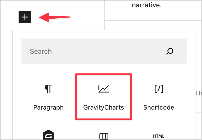
After adding the block to your page layout, you’ll need to choose which chart you want to embed. You can also choose whether to embed a dynamic chart or a static image of your chart. If you choose “Dynamic”, your chart will update when you receive new data to reflect up-to-date insights.
How to Choose the right chart for your data
Choosing the right chart for your data depends on the kind of data you collect, how you want to visualize that data, and the type of analysis you’re conducting. Here’s an overview of different chart types and how to select the best one for your data.
Analyzing trends over time
If you want to analyze your Gravity Forms data against time, you can’t go wrong with a line chart. Charting your data against time helps you evaluate trends during different time periods, and assess how your data has performed over the long term.
Example: If you’re collecting sales data or leads through Gravity Forms, line charts let you visualize performance over different timeframes.
Comparing values
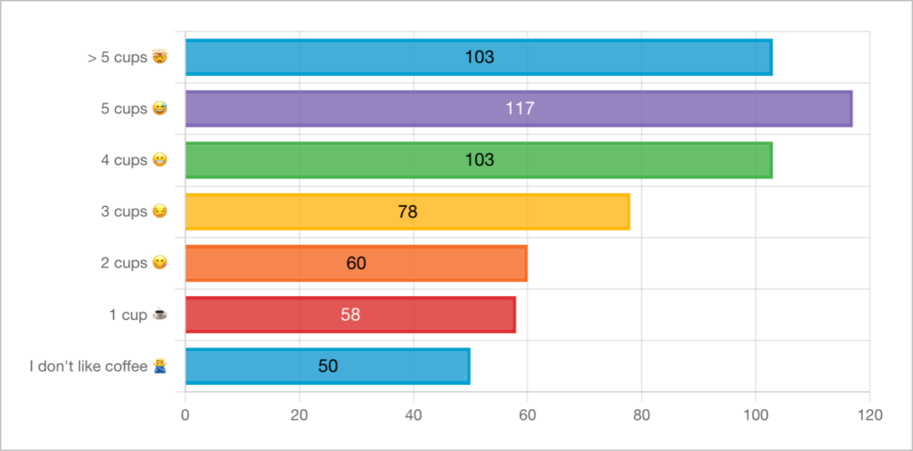
Bar, column, pie, and radar charts are perfect for comparing different sets of data and showcasing the low and high values in the set. These chart types are also helpful when visualizing the results of a poll or survey.
Example: You’re using Gravity Forms to poll your website visitors and want to visualize the results.
Visualizing the distribution of your data
Using a line, column or bar chart, you can effectively visualize the distribution of your data. This helps to pick out trends, identify outliers and make predictions.
Example: You’re collecting sales data in Gravity Forms and want to analyze revenue growth year over year.
Comparing data across multiple categories
Polar area charts are ideal for comparing proportional data across multiple categories, especially when showing the relative size of each segment is important.
Example: You’re using Gravity Forms to collect customer data, and you want to visualize your different customer demographics.
What else can you do with GravityCharts?
Gravity Forms makes it easy to collect all kinds of data on your site. This includes customer information, support requests, survey responses, and product orders. Graphs allow you to identify trends in the data and extract meaningful insights.
Here are some additional ways to gain values from analyzing your Gravity Forms data using charts and graphs:
- Create reports with visuals from a survey
- Analyze the results of your polls
- Create detailed sales reports
- Measure the frequency of event bookings
- Visualize sales trends over time
- Compile business reports or dynamic dashboards
- And much more!
Bonus: How to create business reports and dashboards
GravityCharts integrates with our other Gravity Forms add-ons such as GravityView and GravityMath. These add-ons work together, enabling you to construct powerful dashboards for visualizing and interacting with your Gravity Forms data!
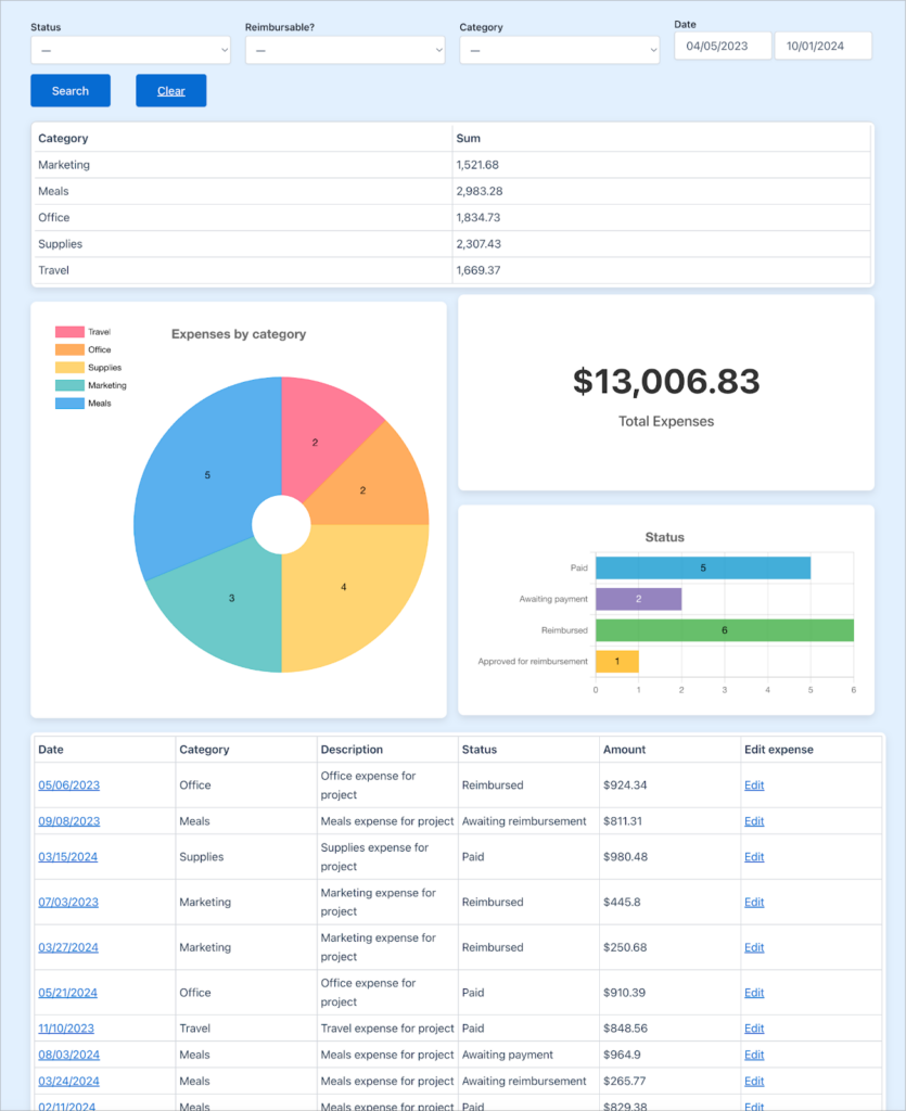
Above is an example of a dashboard I built to track company expenses! If you’re interested in creating solutions like this, check out our detailed tutorials and how-to guides.
Get started with GravityCharts for Gravity Forms today
Taking your form data out of the database and visualizing it with charts and graphs allows you to discern trends over time, compare different datasets, and analyze the distribution of the data you collect.
Creating charts with Gravity Forms has never been easier! If you found this post helpful, try out GravityCharts today.

Helpful tips right in your inbox.
Subscribe to get the latest articles, information on releases and helpful Gravity Forms tips!
More articles

Launch Log: GravitySearch arrives, plus AI spam review and GravityView fixes
This week, releases are anchored by a brand-new product! GravitySearch joins the GravityKit suite with cross-form entry search for Gravity Forms. Alongside it, Gravity Forms Zero Spam picks up an AI-powered review step, and GravityView sees fixes for Enhanced Security, Edit Entry, and Entry…
Meet GravitySearch: advanced global search for Gravity Forms
GravitySearch adds cross-form search to Gravity Forms: find any entry from one screen, build advanced filters, and preview results without leaving the page.

Block MCP is now a free WordPress plugin (and it sets itself up)
Block MCP is now a free WordPress plugin. Connect Claude or any MCP client to your site in minutes and let AI edit your content without breaking blocks.