Published
•
Updated
Announcing GravityCharts 1.4: Plotting data against time, data labels, and more!
GravityCharts 1.4 adds timeline charts, data labels, and more visualization options for Gravity Forms data. Chart trends over time and surface insights from your form submissions.
We just released GravityCharts 1.4! This update sees the addition of several highly-requested features, such as plotting data against time, support for data labels, and more.
GravityCharts is an add-on for Gravity Forms that allows you to transform your form data into stunning charts and graphs. With this latest release, you have even more ways to turn your Gravity Forms data into helpful visuals.
Let’s dive in!
Plotting data against time
As one of the most anticipated new GravityCharts features, we couldn’t be more excited about adding the ability to chart data against time! This gives you new ways to visualize your Gravity Forms data on the front end and extract helpful insights.
With timeline charts, you can:
- See how many people subscribe to your newsletter each day
- Chart your eCommerce revenue vs time
- Track the number of support requests you receive each day
- And lots more!
Let’s take a look at some examples…
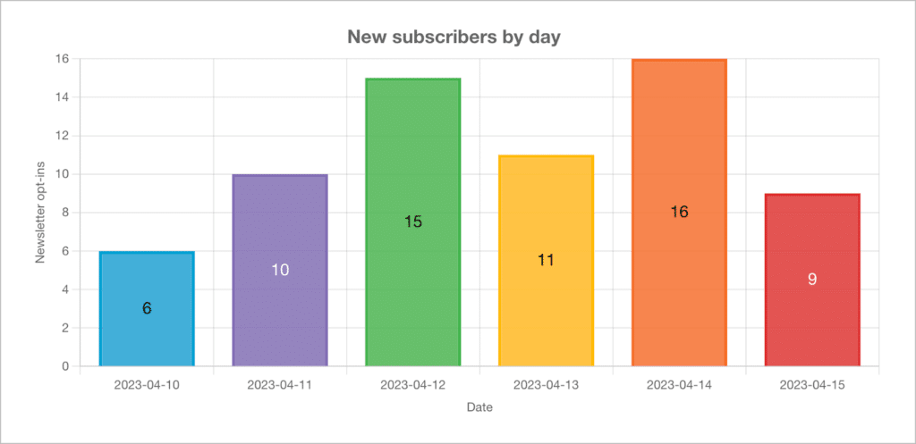
The column chart below is displaying the number of new newsletter subscribers per day:
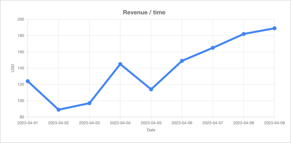
In this example, we are tracking eCommerce revenue over time using a simple line chart:
To create a timeline chart, all you need to do is select the “Show on Timeline” option under “Data Type” in the GravityCharts feed settings.
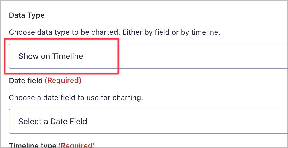
After that, you will need to configure a few additional options. Charting against time is supported for “Number”, “Radio Buttons”, “Checkboxes”, and “Drop Down” fields, as well as all Pricing fields, such as “Product”, “Total”, etc.
There are also a few design options for customizing your timeline charts. When you open the “Axis” drop down, you will be able to adjust the X axis scale and labels. These extra customization options allow you to create the exact chart that you want!
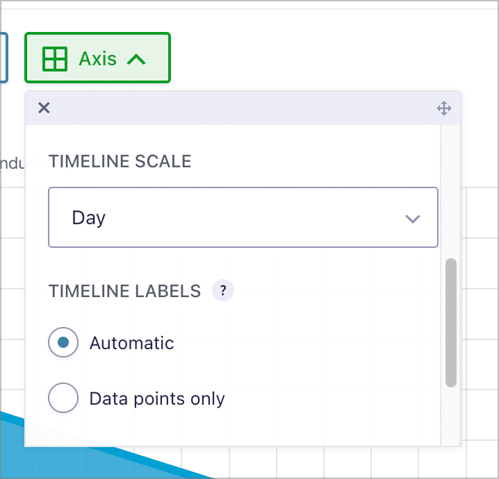
💡 Pro tipSee our documentation to learn more about plotting data against time!
Data labels for select chart types
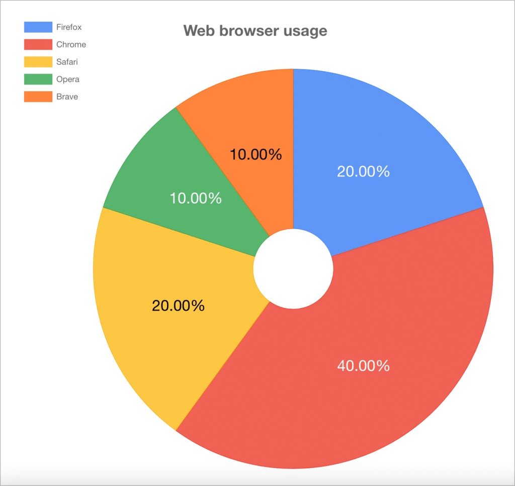
In GravityCharts 1.4, you can now add data labels to bar, column, pie, doughnut, and polar area charts.
To configure labels for a chart, simply click on the “Labels” drop down above the chart preview.
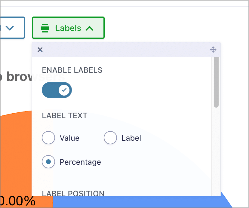
Labels can either display the value associated with the field input, the label of the field choice, or the percentage value of the field relative to the other options. You can also customize them by adjusting the font size, setting custom colors, choosing the label position, and more!
New options for Line and Area charts
Previously, the area underneath the line was always filled in for line and radar charts. Now you have the option to disable this, or adjust its positioning. The new “Area fill” options are available in the “Design” tab.
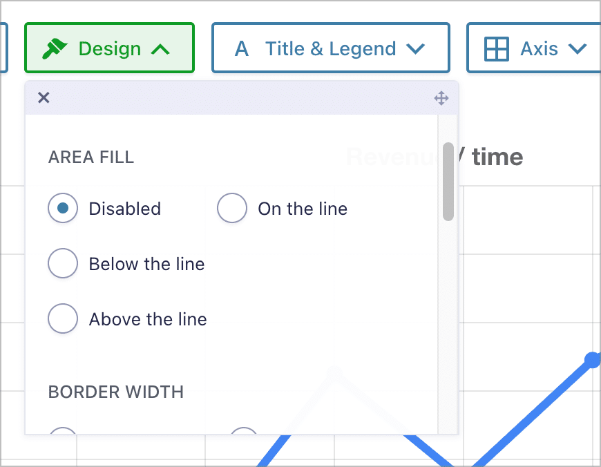
If you’re not quite sure what we mean by “area fill”, take a look at the GIF below.
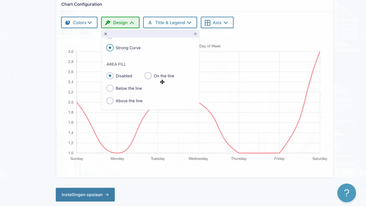
As you can see, the new area fill options give you finer control over the look and feel of your Line and Radar charts on the front end.
Update GravityCharts today!
With the release of GravityCharts 1.4, you have a wealth of new options for transforming your Gravity Forms data into helpful visuals! The highly-requested timelines feature allows you to plot your data against time, opening up new ways to visualize and analyze your form data.
You can upgrade to GravityCharts 1.4 from the “Manage Your Kit” screen under “GravityKit” in your WordPress Admin area. To see the full release, check out the official changelog.
Helpful tips right in your inbox.
Subscribe to get the latest articles, information on releases and helpful Gravity Forms tips!
More articles

Launch Log: GravitySearch arrives, plus AI spam review and GravityView fixes
This week, releases are anchored by a brand-new product! GravitySearch joins the GravityKit suite with cross-form entry search for Gravity Forms. Alongside it, Gravity Forms Zero Spam picks up an AI-powered review step, and GravityView sees fixes for Enhanced Security, Edit Entry, and Entry…
Meet GravitySearch: advanced global search for Gravity Forms
GravitySearch adds cross-form search to Gravity Forms: find any entry from one screen, build advanced filters, and preview results without leaving the page.
Block MCP is now a free WordPress plugin (and it sets itself up)
Block MCP is now a free WordPress plugin. Connect Claude or any MCP client to your site in minutes and let AI edit your content without breaking blocks.